強烈推薦ipython
原文:http://michaelxiang.me/2016/05/14/python-matplotlib-basic/
無論你工作在什麼專案上,IPython都是值得推薦的。利用ipython --pylab,可以進入PyLab模式,已經匯入了matplotlib庫與相關軟體包(例如Numpy和Scipy),額可以直接使用相關庫的功能。
本文作為學習過程中對matplotlib一些常用知識點的整理,方便查詢。
這樣IPython配置為使用你所指定的matplotlib GUI後端(TK/wxPython/PyQt/Mac OS X native/GTK)。對於大部分使用者而言,預設的後端就已經夠用了。Pylab模式還會向IPython引入一大堆模組和函式以提供一種更接近MATLAB的介面。
參考
1
|
import matplotlib.pyplot as plt
|
matplotlib圖示正常顯示中文
為了在圖表中能夠顯示中文和負號等,需要下面一段設定:
1
|
import matplotlib.pyplot as plt
|
matplotlib inline和pylab inline
可以使用ipython --pylab開啟ipython命名視窗。
1
|
%matplotlib inline #notebook模式下
|
這兩個命令都可以在繪圖時,將圖片內嵌在互動視窗,而不是彈出一個圖片視窗,但是,有一個缺陷:除非將程式碼一次執行,否則,無法疊加繪圖,因為在這兩種模式下,是要有plt出現,圖片會立馬show出來,因此:
推薦在ipython notebook時使用,這樣就能很方便的一次編輯完程式碼,繪圖。
為專案設定matplotlib引數
在程式碼執行過程中,有兩種方式更改引數:
- 使用引數字典(rcParams)
- 呼叫matplotlib.rc()命令 通過傳入關鍵字元祖,修改引數
如果不想每次使用matplotlib時都在程式碼部分進行配置,可以修改matplotlib的檔案引數。可以用matplot.get_config()命令來找到當前使用者的配置檔案目錄。
配置檔案包括以下配置項:
axex: 設定座標軸邊界和表面的顏色、座標刻度值大小和網格的顯示
backend: 設定目標暑促TkAgg和GTKAgg
figure: 控制dpi、邊界顏色、圖形大小、和子區( subplot)設定
font: 字型集(font family)、字型大小和樣式設定
grid: 設定網格顏色和線性
legend: 設定圖例和其中的文字的顯示
line: 設定線條(顏色、線型、寬度等)和標記
patch: 是填充2D空間的圖形物件,如多邊形和圓。控制線寬、顏色和抗鋸齒設定等。
savefig: 可以對儲存的圖形進行單獨設定。例如,設定渲染的檔案的背景為白色。
verbose: 設定matplotlib在執行期間資訊輸出,如silent、helpful、debug和debug-annoying。
xticks和yticks: 為x,y軸的主刻度和次刻度設定顏色、大小、方向,以及標籤大小。線條相關屬性標記設定
用來該表線條的屬性
| 線條風格linestyle或ls | 描述 | 線條風格linestyle或ls | 描述 | |
|---|---|---|---|---|
| ‘-‘ | 實線 | ‘:’ | 虛線 | |
| ‘–’ | 破折線 | ‘None’,’ ‘,’’ | 什麼都不畫 | |
| ‘-.’ | 點劃線 |
線條標記
| 標記maker | 描述 | 標記 | 描述 | |
|---|---|---|---|---|
| ‘o’ | 圓圈 | ‘.’ | 點 | |
| ‘D’ | 菱形 | ‘s’ | 正方形 | |
| ‘h’ | 六邊形1 | ‘*’ | 星號 | |
| ‘H’ | 六邊形2 | ‘d’ | 小菱形 | |
| ‘_’ | 水平線 | ‘v’ | 一角朝下的三角形 | |
| ‘8’ | 八邊形 | ‘<’ | 一角朝左的三角形 | |
| ‘p’ | 五邊形 | ‘>’ | 一角朝右的三角形 | |
| ‘,’ | 畫素 | ‘^’ | 一角朝上的三角形 | |
| ‘+’ | 加號 | ‘\ | ‘ | 豎線 |
| ‘None’,’’,’ ‘ | 無 | ‘x’ | X |
顏色
可以通過呼叫matplotlib.pyplot.colors()得到matplotlib支援的所有顏色。
| 別名 | 顏色 | 別名 | 顏色 | |
|---|---|---|---|---|
| b | 藍色 | g | 綠色 | |
| r | 紅色 | y | 黃色 | |
| c | 青色 | k | 黑色 | |
| m | 洋紅色 | w | 白色 |
如果這兩種顏色不夠用,還可以通過兩種其他方式來定義顏色值:
- 使用HTML十六進位制字串
color='eeefff'使用合法的HTML顏色名字(’red’,’chartreuse’等)。 - 也可以傳入一個歸一化到[0,1]的RGB元祖。
color=(0.3,0.3,0.4)
很多方法可以介紹顏色引數,如title()。plt.tilte('Title in a custom color',color='#123456')
背景色
通過向如matplotlib.pyplot.axes()或者matplotlib.pyplot.subplot()這樣的方法提供一個axisbg引數,可以指定座標這的背景色。
subplot(111,axisbg=(0.1843,0.3098,0.3098)
基礎
如果你向plot()指令提供了一維的陣列或列表,那麼matplotlib將預設它是一系列的y值,並自動為你生成x的值。預設的x向量從0開始並且具有和y同樣的長度,因此x的資料是[0,1,2,3].
圖片來自:繪圖: matplotlib核心剖析
確定座標範圍
- plt.axis([xmin, xmax, ymin, ymax])
上面例子裡的axis()命令給定了座標範圍。 - xlim(xmin, xmax)和ylim(ymin, ymax)來調整x,y座標範圍
1
2
3
4
5
6
7
8
9
10
11
12
13
14
15
16
17
18%matplotlib inline
import numpy as np
import matplotlib.pyplot as plt
from pylab import *
x = np.arange(-5.0, 5.0, 0.02)
y1 = np.sin(x)
plt.figure(1)
plt.subplot(211)
plt.plot(x, y1)
plt.subplot(212)
#設定x軸範圍
xlim(-2.5, 2.5)
#設定y軸範圍
ylim(-1, 1)
plt.plot(x, y1)
疊加圖
用一條指令畫多條不同格式的線。
1
|
import numpy as np
|
plt.figure()
你可以多次使用figure命令來產生多個圖,其中,圖片號按順序增加。這裡,要注意一個概念當前圖和當前座標。所有繪圖操作僅對當前圖和當前座標有效。通常,你並不需要考慮這些事,下面的這個例子為大家演示這一細節。
1
|
import matplotlib.pyplot as plt
|
figure感覺就是給影象ID,之後可以索引定位到它。
plt.text()新增文字說明
- text()可以在圖中的任意位置新增文字,並支援LaTex語法
- xlable(), ylable()用於新增x軸和y軸標籤
- title()用於新增圖的題目
1
|
import numpy as np
|
plt.annotate()文字註釋
在資料視覺化的過程中,圖片中的文字經常被用來註釋圖中的一些特徵。使用annotate()方法可以很方便地新增此類註釋。在使用annotate時,要考慮兩個點的座標:被註釋的地方xy(x, y)和插入文字的地方xytext(x, y)。[^1]
1
|
import numpy as np
|
plt.xticks()/plt.yticks()設定軸記號
現在是明白乾嘛用的了,就是人為設定座標軸的刻度顯示的值。
1
|
# 匯入 matplotlib 的所有內容(nympy 可以用 np 這個名字來使用)
|
當我們設定記號的時候,我們可以同時設定記號的標籤。注意這裡使用了 LaTeX。[^2]
[^2]:Matplotlib 教程
移動脊柱 座標系
1
|
ax = gca()
|
這個地方確實沒看懂,囧,以後再說吧,感覺就是移動了座標軸的位置。
plt.legend()新增圖例
1
|
plot(X, C, color="blue", linewidth=2.5, linestyle="-", label="cosine")
|
matplotlib.pyplot
使用plt.style.use('ggplot')命令,可以作出ggplot風格的圖片。
1
|
# Import necessary packages
|
給特殊點做註釋
好吧,又是註釋,多個例子參考一下!
我們希望在 2π/32π/3 的位置給兩條函式曲線加上一個註釋。首先,我們在對應的函式影象位置上畫一個點;然後,向橫軸引一條垂線,以虛線標記;最後,寫上標籤。
1
|
t = 2*np.pi/3
|
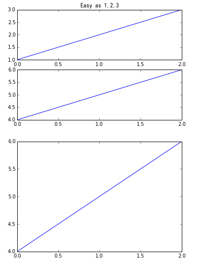
plt.subplot()
plt.subplot(2,3,1)表示把圖示分割成2*3的網格。也可以簡寫plt.subplot(231)。其中,第一個引數是行數,第二個引數是列數,第三個參數列示圖形的標號。
plt.axes()
我們先來看什麼是Figure和Axes物件。在matplotlib中,整個影象為一個Figure物件。在Figure物件中可以包含一個,或者多個Axes物件。每個Axes物件都是一個擁有自己座標系統的繪圖區域。其邏輯關係如下^3:
- axes() by itself creates a default full subplot(111) window axis.
- axes(rect, axisbg=’w’) where rect = [left, bottom, width, height] in normalized (0, 1) units. axisbg is the background color for the axis, default white.
- axes(h) where h is an axes instance makes h the current axis. An Axes instance is returned.
rect=[左, 下, 寬, 高] 規定的矩形區域,rect矩形簡寫,這裡的數值都是以figure大小為比例,因此,若是要兩個axes並排顯示,那麼axes[2]的左=axes[1].左+axes[1].寬,這樣axes[2]才不會和axes[1]重疊。
show code:
1
|
http://matplotlib.org/examples/pylab_examples/axes_demo.html
|
[^3]:繪圖: matplotlib核心剖析
pyplot.pie引數
colors顏色
找出matpltlib.pyplot.plot中的colors可以取哪些值?
- so-Named colors in matplotlib
- CSDN-matplotlib學習之(四)設定線條顏色、形狀
1
2for name,hex in matplotlib.colors.cnames.iteritems():
print name,hex
列印顏色值和對應的RGB值。
plt.axis('equal')避免比例壓縮為橢圓
autopct
- How
do I use matplotlib autopct?
1autopct enables you to display the percent value using Python string formatting. For example, if autopct='%.2f', then for each pie wedge, the format string is '%.2f' and the numerical percent value for that wedge is pct, so the wedge label is set to the string '%.2f'%pct.