Android實習收穫:UI細節bug引發的layout_weight深入理解
今天在修改一個佈局問題時候,發現自己對權重的理解還不夠。
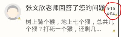
首先問題如圖:

一個TextView沒有按要求顯示完整,顯示成了2行。
怎麼辦呢?
方法1:是把它左面的字型放小。
結果師兄說不可以隨意修改佈局的尺寸,否則測試還會提bug。方法2:不讓改字型,那就修改邊距,圖片的margin,textView的magin,統統改了遍。
結果可想而知,這麼大的變動更不可以。師兄看我這麼愚鈍,指點了一下:不修改佈局,怎樣能讓時間不論在什麼情況下都顯示呢?
- 我的做法:
            <TextView
                android:id="@+id/teacher_name"
                android:layout_width="wrap_content"
                android:layout_height="wrap_content"
                android:text="張文欣老師回答了您的問題"
                android:textColor="@color/color_blackest_text"
                android:textSize="@dimen/text_size_mediumer" />

            <TextView
                android:id="@+id/notice_time"
                android:layout_width="0dp"
                android:layout_height="wrap_content"
                android:layout_weight="1"
                android:singleLine="true"
                android:layout_marginLeft="3dp"
                android:text="5-16 4:04"
android:textSize="@dimen/text_size_smaller" />- 顯示佈局:
- 還是那樣。
- 為什麼呢? 設定layout_weight = “1”不就是為了保證它在什麼情況下都顯示嗎?怎麼回事。
4。師兄看不下去了,親自示範給我,程式碼如下:
 <TextView
                android:id="@+id/teacher_name"
                android:layout_width="0dp"
                android:layout_height="wrap_content"
                android:layout_weight="1"
                android:singleLine="true"
                android:text="張文欣老師回答了您的問題"
                android:textColor="@color/color_blackest_text"
                android:textSize="@dimen/text_size_mediumer" />

            <TextView
                android:id="@+id/notice_time"
                android:layout_width="wrap_content"
                android:layout_height="wrap_content"
                android:layout_marginLeft="3dp"
                android:text="5-16 4:04"
android:textSize="@dimen/text_size_smaller" />- 哇塞,這次ok了:

雖然一樣都是設定layout_weight,但是設定在什麼位置就顯示出了對它的理解。
我之前的理解一直都是把某個元件的寬或者高設定為0,然後再設定個權重為1,它就會填充所有剩下的空間。事實上很多時候也奏效了。
今天這次讓我仔細看了之前的一篇文章【Android入門的常見問題Part1】android:layout_weight的理解,結合這次的問題,好好思考了一下layout_weight的用法。
用法總結:
最常見的使用權重都是設定寬或者高為0dp,然後設定權重為1.而且整個佈局中只有這一個權重。
- 比如說在一個listView下有個button,listView高度不確定,想讓button始終顯示,就給listView設定個權重。
- 為什麼這麼用會有這樣的效果呢?
- 首先要明白,layout_weight表示的是對剩餘空間的佔有比例,我再強調一下,是剩餘!
- 既然是挑剩下的,那自然應該先讓除他以外的其他元件顯示。
- 就比如說開篇的那個問題,想讓顯示時間的TextView不論何時都顯示,就給其他的某個不太重要的元件設定權重,讓那個不重要的自己根據剩餘空間顯示大小。
還有的時候我們佈局中不僅一個權重,比如說為了螢幕適配,給佈局中的所有子元件都設定權重,那麼子元件就會佔據權重響應的比例。
- 比如說:
<LinearLayout
            android:layout_width="match_parent"
            android:layout_height="wrap_content"
            android:orientation="vertical" >

            <Button
                android:id="@+id/button1"
                android:layout_width="0dp"
                android:layout_height="wrap_content"
                android:layout_weight="2"
                android:text="1"
                android:textSize="20sp" />
            <Button
                android:id="@+id/button2"
                android:layout_width="0dp"
                android:layout_height="wrap_content"
                android:layout_weight="1"
                android:text="2"
                android:textSize="20sp" />
</LinearLayout>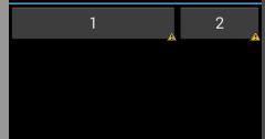
- button1會佔據2/3的位置,button2會佔據1/3.
- 注意,兩個Button的寬度都是0dp
3.在2的情況下,我們設定Button的寬度為wrap_content:
<LinearLayout
            android:layout_width="match_parent"
            android:layout_height="wrap_content"
            android:orientation="horizontal" >

            <Button
                android:id="@+id/button1"
                android:layout_width="wrap_content"
                android:layout_height="wrap_content"
                android:layout_weight="2"
                android:text="1"
                android:textSize="20sp" />
            <Button
                android:id="@+id/button2"
                android:layout_width="wrap_content"
                android:layout_height="wrap_content"
                android:layout_weight="1"
                android:text="2"
                android:textSize="20sp" />
</LinearLayout>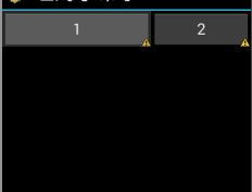
- 還是之前強調的,layout_weight分配的是剩餘的空間。
- 上述程式碼中我們將2個按鈕的寬度都設為wrap_content,假設他倆寬度都是2,整個佈局寬度為10.
- 那麼button1實際得到的寬度是:2 + (10 -2 -2)*(2/3) = 6
- button2實際得到的寬度是: 2 + (10 -2 -2)*(1/3) = 4
4.在3的情況下,我們設定Button的寬度為match_parent:
<LinearLayout
            android:layout_width="match_parent"
            android:layout_height="wrap_content"
            android:orientation="horizontal" >

            <Button
                android:id="@+id/button1"
                android:layout_width="match_parent"
                android:layout_height="wrap_content"
                android:layout_weight="2"
                android:text="1"
                android:textSize="20sp" />
            <Button
                android:id="@+id/button2"
                android:layout_width="match_parent"
                android:layout_height="wrap_content"
                android:layout_weight="1"
                android:text="2"
                android:textSize="20sp" />
</LinearLayout>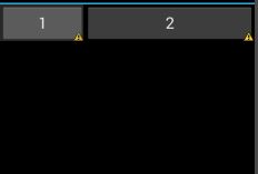
- 我們看到1和2的比例相反了,為什麼呢?
- 上述程式碼中我們將第一個按鈕就設定為match_parent,即填充整個佈局。第二個也設定為match_parent,如果沒有權重,第二個是不會顯示的。
- 如果兩個元件所佔的空間之和超過了整個空間的大小,假設整個佈局的寬度為10,2個按鈕由於設定match_parent理論上的寬度也分別為10,這樣2個元件超過了空間,該怎麼分配呢?
- 超出的部分也按照權重來分,不過是在元件原來佔有空間的基礎上來減去這個值
- 所以2個按鈕實際得到的大小為:
- button1實際得到的寬度是:10-(10+10-10)*2/3=1/3個空間大小
- button2實際得到的寬度是: 10-(10+10-10)*1/3=2/3個空間大小。
這就解釋了為什麼有時候weight值大,佔有的權重反而小。
權重所佔的比例與對應的寬度、高度有關,視情況而定,不可死記硬背。
不過要理解的就是分配的是剩下的空間,優先順序最低。
相關文章
- 一次JSF上線問題引發的MsgPack深入理解,保證對你有收穫JS
- 深入理解Plasma(二)Plasma 細節ASM
- Android之深刻理解layout_weightAndroid
- [譯] ES6:理解引數預設值的實現細節
- 理解virtual dom的實現細節-snabbdom
- 深度學習 SSD的理解和細節分析深度學習
- SAP 電商雲 Spartacus UI 的響應式 UI 實現細節UI
- 要想深入理解設計模式,就必須究其細節設計模式
- 工作間隙整理學習內容的意外收穫
- eMarketer:收穫大資料的果實很難大資料
- 特別的開發階段,特別的收穫
- 「前端 BUG 錄」變更 UI 庫主題引發的問題前端UI
- 昨晚的收穫DB2DB2
- UI設計細節及技巧UI
- 慢慢細談Android 面試的細節Android面試
- 女性向遊戲設計:從使用者理解出發,收穫每一個玩家遊戲設計
- 從細節理解鎖的升級
- 深入理解Flutter UI系統FlutterUI
- 提供一個論文的組織(命名)方式,記錄自己的理解收穫
- 深入理解mysql引數MySql
- 搞java兩年了,發現自己收穫不大Java
- 深入理解AndroidAndroid
- 一個bug引發的Android分割槽儲存的思考Android
- Android CardView 開發過程中要注意的細節AndroidView
- JavaScript引數傳遞的深入理解JavaScript
- 如何讓網站收穫好的排名?網站
- 深入探究JVM之垃圾回收演算法實現細節JVM演算法
- Layer的實現細節
- 深入理解 Android 中的 MatrixAndroid
- 一個排序引發的BUG排序
- 筆記——Android 中的小細節筆記Android
- 使用 ClojureScript 開發瀏覽器外掛的過程與收穫瀏覽器
- 開發者總結AAA遊戲開發經歷的5點收穫遊戲開發
- MBA國際貿易課程學習中的一些收穫
- Android:layout_weight屬性的兩種用法Android
- 關於 SAP UI5 Context.prototype.delete 方法的輸入引數 Group ID 的細節UIContextdelete
- 前端專案重構的些許收穫前端
- 在創業型軟體公司的收穫創業