Android:layout_weight屬性的兩種用法
weight屬性用於設定控制元件長和寬所佔的比例
首先看一個例子:
Example.1
<LinearLayout xmlns:android="http://schemas.android.com/apk/res/android"
    android:layout_width="match_parent"
    android:layout_height="match_parent"
    android:orientation="horizontal" >

    <Button
        android:id="@+id/button2"
        android:layout_width="wrap_content"
        android:layout_height="wrap_content"
        android:layout_weight="1"
        android:text="Button" />

    <Button
        android:id="@+id/button1"
        android:layout_width="wrap_content"
        android:layout_height="wrap_content"
        android:layout_weight="1"
        android:text="Button" />

</LinearLayout>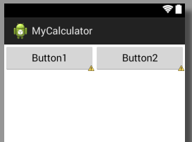
以上兩個button控制元件的長和寬都是wrap,即自動適應;
同時設定weight為1,而其共同的母框架排列方式orientation=”horizontal”,即內部控制元件水平排列
那麼這個時候的效果就是兩個控制元件平分母框架的寬度,同時也是母框架的排列方向上的控制元件,此時若修改Linearlayout中orientation=”vertical”則會變成:
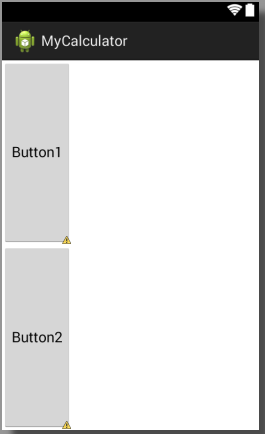
也就是兩個控制元件平分了縱向的空間
擴充
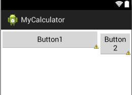
修改weight分別為1,2:
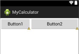
可以看到button2的寬度明顯沒有達到button1的3倍
這是因為button的寬度為wrap,無論如何分配都會是button內容完全顯示出來,而將其所在母框架所有空間至少全部顯示以後剩餘的寬度才會按照weight的比例進行分配,所以button2的寬度並未達到button1的3倍;
而如果修改button1和button2的width=”0dp”,則才會完全按照比例進行分配,如圖:
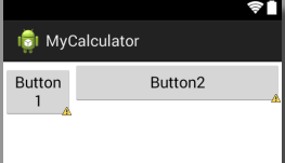
此時我們也可以看到button2的寬度基本達到button1的3倍?
所以若需要使用weight按比例分配空間,請將要分配的方向長度設為“0dp”,而這也是google官方推薦的用法。
Example.2
來看第二個例子:
<LinearLayout xmlns:android="http://schemas.android.com/apk/res/android"
    android:layout_width="match_parent"
    android:layout_height="match_parent"
    android:orientation="horizontal" >
    <Button
        android:id="@+id/button2"
        android:layout_width="match_parent"
        android:layout_height="wrap_content"
        android:layout_weight="1"
        android:text="Button1" />
    <Button
        android:id="@+id/button1"
        android:layout_width="match_parent"
        android:layout_height="wrap_content"
        android:layout_weight="3"
        android:text="Button2" />
</LinearLayout>
這裡將寬度設定為match,比例仍然是1:3,,效果如圖:
可以看到,其顯示比例反而變成了3:1,這就是weight的另外一個用法,那麼這種用法既然與Example1中的效果相同,那又有什麼意義呢,暫時我也不得而知,但是我在實際開發中遇到了這個方法的應用場景,程式碼如下:
 <LinearLayout
        android:layout_width="match_parent"
        android:layout_height="wrap_content"
        android:orientation="horizontal" >
        <Button
            android:layout_margin="10dp"
            android:layout_width="0dp"
            android:layout_height="wrap_content"
            android:layout_weight="1"
            android:text="1"/>
        <Button
            android:layout_margin="10dp"
            android:layout_width="0dp"
            android:layout_height="wrap_content"
            android:layout_weight="1"
            android:text="1"/>
        <Button
            android:layout_margin="10dp"
            android:layout_width="0dp"
            android:layout_height="wrap_content"
            android:layout_weight="1"
            android:text="1"/>
    </LinearLayout>
    <LinearLayout
        android:layout_width="match_parent"
        android:layout_height="wrap_content"
        android:orientation="horizontal" >
        <Button
            android:layout_margin="10dp"
            android:layout_width="0dp"
            android:layout_height="wrap_content"
            android:layout_weight="2"
            android:text="1"/>
        <Button
            android:layout_margin="10dp"
            android:layout_width="0dp"
            android:layout_height="wrap_content"
            android:layout_weight="1"
            android:text="1"/>
    </LinearLayout>
一般為了美觀,我們會為各個控制元件之間增加間距,即通過margin屬性來設定,在這個例子中,為每個button都設定了四個方向為10dp的間隙,然後我們將上方3個button平均分配,下面兩個控制元件按照2:1的比例進行分配,
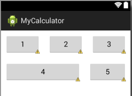
明顯可以看出,button4的右邊緣並未與button2的右邊緣對其,同時導致button5喜愛那個做傾斜了好多,畫面並不協調,這是為什呢,抱歉我也不知道。
而如果採用上述所講的第二種用法:
即將button4和button5的寬度改為match_parent,同時設定比例為1:2,效果如圖:
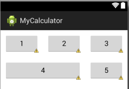
button4與button2的右邊緣完全對齊了,介面是不是更加美觀了?
Question
- 當為控制元件設定margin屬性的時候,不能完全按照比例進行分配,原因不明;
- 通過第二種用法可以修復上述問題,原理不明。
如果你知道我問題的答案,歡迎留言。
相關文章
- 關於android:layout_weight屬性使用注意事項Android
- Android屬性動畫詳解(一),屬性動畫基本用法Android動畫
- html中Position屬性值介紹和position屬性四種用法HTML
- CSS zoom屬性用法CSSOOM
- win10桌面屬性在哪裡_win10開啟桌面屬性的兩種方法Win10
- css詳解position五種屬性用法及其含義CSS
- js的屬性物件的specified屬性用法簡單介紹JS物件
- js的returnValue屬性用法介紹JS
- React屬性用法總結React
- javascript textContent屬性用法JavaScript
- background屬性用法詳解
- UITableView 屬性用法詳解UIView
- Android屬性動畫完全解析(中),ValueAnimator和ObjectAnimator的高階用法Android動畫Object
- KVO監聽容器類(陣列,字典等)屬性的兩種方法陣列
- (八)Mybatis當中#{}常用屬性的用法MyBatis
- clientWidth和clientHeight屬性的用法client
- 談談ThreadStatic屬性用法thread
- css transition屬性用法介紹CSS
- javascript callee和caller屬性用法JavaScript
- pageYOffset與pageXOffset屬性用法
- css border-color屬性用法CSS
- list-style-image屬性用法
- easyui tree自定義屬性用法UI
- 【Android】神奇的android:clipChildren屬性Android
- Android XML 屬性AndroidXML
- android屬性動畫Android動畫
- android:screenOrientation屬性Android
- Android 《CardView 屬性》AndroidView
- 表單元素的form屬性用法介紹ORM
- input placeholder屬性用法介紹
- outerHTML屬性用法簡單介紹HTML
- Android Notification 用法的4種形式Android
- FutureTask的用法及兩種常用的使用場景
- Android 樣式屬性的使用Android
- vue中vuex的五個基本屬性和用法Vue
- SAP BW Dimension 設定的兩個屬性
- slick對超過22個屬性的表進行對映的兩種辦法
- Android 屬性動畫(二)Android動畫