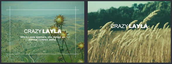
下面我們一起來看看實現這款CSS3滑鼠懸停動畫的過程和程式碼,程式碼主要由HTML和CSS組成。
HTML程式碼:
<div class="grid">
                        <figure class="effect-lily">
                                <img src="img/12.jpg" alt="img12"/>
                                <figcaption>
                                        <div>
                                                <h2>Nice <span>Lily</span></h2>
                                                <p>Lily likes to play with crayons and pencils</p>
                                        </div>
                                        <a href="#">View more</a>
                                </figcaption>
                        </figure>
                        <figure class="effect-lily">
                                <img src="img/1.jpg" alt="img1"/>
                                <figcaption>
                                        <div>
                                                <h2>Nice <span>Lily</span></h2>
                                                <p>Lily likes to play with crayons and pencils</p>
                                        </div>
                                        <a href="#">View more</a>
                                </figcaption>
                        </figure>
                </div>
這裡我們一兩張圖片為例,下面是渲染的CSS程式碼
CSS程式碼
figure.effect-lily img {
        max-width: none;
        width: -webkit-calc(100% + 50px);
        width: calc(100% + 50px);
        opacity: 0.7;
        -webkit-transition: opacity 0.35s, -webkit-transform 0.35s;
        transition: opacity 0.35s, transform 0.35s;
        -webkit-transform: translate3d(-40px,0, 0);
        transform: translate3d(-40px,0,0);
}

figure.effect-lily figcaption {
        text-align: left;
}

figure.effect-lily figcaption > div {
        position: absolute;
        bottom: 0;
        left: 0;
        padding: 2em;
        width: 100%;
        height: 50%;
}

figure.effect-lily h2,
figure.effect-lily p {
        -webkit-transform: translate3d(0,40px,0);
        transform: translate3d(0,40px,0);
}

figure.effect-lily h2 {
        -webkit-transition: -webkit-transform 0.35s;
        transition: transform 0.35s;
}

figure.effect-lily p {
        color: rgba(255,255,255,0.8);
        opacity: 0;
        -webkit-transition: opacity 0.2s, -webkit-transform 0.35s;
        transition: opacity 0.2s, transform 0.35s;
}

figure.effect-lily:hover img,
figure.effect-lily:hover p {
        opacity: 1;
}

figure.effect-lily:hover img,
figure.effect-lily:hover h2,
figure.effect-lily:hover p {
        -webkit-transform: translate3d(0,0,0);
        transform: translate3d(0,0,0);
}

figure.effect-lily:hover p {
        -webkit-transition-delay: 0.05s;
        transition-delay: 0.05s;
        -webkit-transition-duration: 0.35s;
        transition-duration: 0.35s;
}
其他的效果大家可以下載原始碼來看看,效果很不錯。
相關閱讀
評論(1)