線上預覽 原始碼下載
這個例項完全由css3實現的沒有任何js程式碼。下面我們一起看下實現程式碼吧
html程式碼:
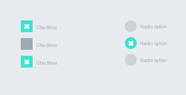
 <div style="width:200px; float:left">
            <label>
                <input type="checkbox" class="option-input checkbox" checked="">
                Checkbox
            </label>
            <label>
                <input type="checkbox" class="option-input checkbox">
                Checkbox
            </label>
            <label>
                <input type="checkbox" class="option-input checkbox">
                Checkbox
            </label>
        </div>
        <div style="width:200px; float:left">
            <label>
                <input type="radio" class="option-input radio" name="example">
                Radio option
            </label>
            <label>
                <input type="radio" class="option-input radio" name="example">
                Radio option
            </label>
            <label>
                <input type="radio" class="option-input radio" name="example">
                Radio option
            </label>
        </div>
css3程式碼:
@-webkit-keyframes click-wave {
  0% {
    width: 40px;
    height: 40px;
    opacity: 0.35;
    position: relative;
  }
  100% {
    width: 200px;
    height: 200px;
    margin-left: -80px;
    margin-top: -80px;
    opacity: 0.0;
  }
}
@-moz-keyframes click-wave {
  0% {
    width: 40px;
    height: 40px;
    opacity: 0.35;
    position: relative;
  }
  100% {
    width: 200px;
    height: 200px;
    margin-left: -80px;
    margin-top: -80px;
    opacity: 0.0;
  }
}
@-o-keyframes click-wave {
  0% {
    width: 40px;
    height: 40px;
    opacity: 0.35;
    position: relative;
  }
  100% {
    width: 200px;
    height: 200px;
    margin-left: -80px;
    margin-top: -80px;
    opacity: 0.0;
  }
}
@keyframes click-wave {
  0% {
    width: 40px;
    height: 40px;
    opacity: 0.35;
    position: relative;
  }
  100% {
    width: 200px;
    height: 200px;
    margin-left: -80px;
    margin-top: -80px;
    opacity: 0.0;
  }
}
.option-input {
  -webkit-appearance: none;
  -moz-appearance: none;
  -ms-appearance: none;
  -o-appearance: none;
  appearance: none;
  position: relative;
  top: 13.33333px;
  width: 40px;
  height: 40px;
  -webkit-transition: all 0.15s ease-out 0;
  -moz-transition: all 0.15s ease-out 0;
  transition: all 0.15s ease-out 0;
  background: #cbd1d8;
  border: none;
  color: #fff;
  cursor: pointer;
  display: inline-block;
  outline: none;
  position: relative;
  margin-right: 0.5rem;
  z-index: 1000;
}
.option-input:hover {
  background: #9faab7;
}
.option-input:checked {
  background: #40e0d0;
}
.option-input:checked::before {
  width: 40px;
  height: 40px;
  position: absolute;
  content: '\2716';
  display: inline-block;
  font-size: 26.66667px;
  text-align: center;
  line-height: 40px;
}
.option-input:checked::after {
  -webkit-animation: click-wave 0.65s;
  -moz-animation: click-wave 0.65s;
  animation: click-wave 0.65s;
  background: #40e0d0;
  content: '';
  display: block;
  position: relative;
  z-index: 100;
}
.option-input.radio {
  border-radius: 50%;
}
.option-input.radio::after {
  border-radius: 50%;
}

body {
  display: -webkit-box;
  display: -moz-box;
  display: box;
  -webkit-box-orient: horizontal;
  -moz-box-orient: horizontal;
  box-orient: horizontal;
  -webkit-box-pack: start;
  -moz-box-pack: start;
  box-pack: start;
  -webkit-box-align: stretch;
  -moz-box-align: stretch;
  box-align: stretch;
  background: #e8ebee;
  color: #9faab7;
  font-family: "Helvetica Neue", Helvetica, Arial, sans-serif;
  text-align: center;
}
body div {
  padding: 5rem;
}
body label {
  display: block;
  line-height: 40px;
}
是不是很簡單。只要複製上面的html程式碼和css程式碼到頁面上。執行就可以看到效果了。趕緊試一試吧。哈哈
相關閱讀
評論(2)