上章我們學習了:12.Quick QML-QML 佈局(Row、Column、Grid、Flow和巢狀佈局) 、Repeater物件,本章我們繼續來學習佈局管理器
1.RowLayout、ColumnLayout、GridLayout佈局管理器介紹
RowLayout、ColumnLayout、GridLayout佈局管理器和Row、Column、Grid佈局器非常相似,但是在佈局管理器裡就不支援使用Positioner附加屬性了.
並且在佈局器的基礎上,為每個item提供了下面幾個附加屬性:
- Layout.minimumWidth
- Layout.minimumHeight
- Layout.maximumWidth
- Layout.maximumHeight
- Layout.preferredWidth : 首選寬度。如果未設定,那麼佈局將使用隱式寬度(implicitWidth)。預設值為-1。
- Layout.preferredHeight : 首選高度。如果未設定,那麼佈局將使用隱式高度。預設值為-1。
- Layout.fillWidth : bool型別,預設為false,如果為true,那麼該item的寬度會盡可能寬(可以伸縮),如果為false,那麼寬度的優先順序選擇為: Layout.preferredWidth > implicitWidth > Layout.minimumWidth
- Layout.fillHeight : 和Layout.fillWidth一樣,設定高度是否可以伸縮
- Layout.alignment : 設定item在網格里的對齊方式,預設值為" Qt.AlignVCenter | Qt.AlignLeft "
- Layout.margins : 設定item的外邊距
- Layout.leftMargin
- Layout.rightMargin
- Layout.topMargin
- Layout.bottomMargin
由於RowLayout和ColumnLayout其實本質就是單行或者單列的GridLayout.所以我們以GridLayout為例講解.
2. GridLayout佈局管理器介紹
它的屬性如下所示:
- rowSpacing : real,設定每行的間隔,預設值為5
- columnSpacing : real,設定每列的間隔,預設值為5
- rows : int,預設值為-1,用來設定網格有多少行
- columns : int,預設值為-1,用來設定網格有多少列
- flow : enumeration,流佈局,取值有:
- GridLayout.LeftToRight: 從左往右排列,如果剩餘的寬度不足,則排下一行(預設值)
- Flow.TopToBottom: 從上往下排列,如果剩餘的寬度不足,則排下一列.
- layoutDirection : enumeration,佈局方向,取值有:
- Qt.LeftToRight (default) : 預設方向
- Qt.RightToLeft : 左右取反方向(比如佈局順序為123,將會變為321)
並且GridLayout在RowLayout和ColumnLayout的附加屬性基礎上,還額外增加了下面幾個附加屬性:
- Layout.row : 指定item在網格中的行位置。預設值為0,由佈局為專案自動分配單元格。
- Layout.column: 指定item在網格中的列位置。預設值為0,由佈局為專案自動分配單元格。
- Layout.rowSpan : 指定item在網格中的行跨度,預設值為1。
- Layout.columnSpan : 指定item在網格中的列跨度,預設值為1。
3.flow 和layoutDirection介紹
flow表示每個網格的排列方向.
layoutDirection表示佈局方向,如果layoutDirection = Qt.RightToLeft,那麼就會將水平方向的排列進行水平映象.
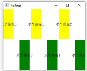
比如預設顯示的是:

設定layoutDirection = Qt.RightToLeft後,那麼顯示的將會是:

示例程式碼如下所示:
Window {
    width: 320;
    height: 240;
    visible: true;

    GridLayout{
          id: grid
          rows: 3
          flow: GridLayout.LeftToRight
          layoutDirection: Qt.LeftToRight
          anchors.fill: parent
          Repeater {
              model: 3
              Rectangle {
                  color: "yellow"
                  Layout.alignment: Qt.AlignLeft   // 水平靠左
                  Layout.fillHeight: true       // 設定高度可伸縮
                  Layout.preferredWidth: 40
                  Layout.preferredHeight: 70
                  Text {
                      anchors.centerIn: parent
                      font.pixelSize: 14
                      text: "水平靠左"+index
                  }
                  Component.onCompleted: {

                      console.log(Layout.row +","+ Layout.column)

                  }
              }
          }

          Repeater {
              model: 3
              Rectangle {
                  Layout.alignment: Qt.AlignVCenter | Qt.AlignRight
                  color: "green"
                  Layout.fillHeight: true       // 設定高度可伸縮
                  Layout.preferredWidth: 40
                  Layout.preferredHeight: 70
                  Text {
                      anchors.centerIn: parent
                      font.pixelSize: 14
                      text: "水平靠右"+index
                  }
              }
          }
    }

}
設定"flow: GridLayout.LeftToRight"、"layoutDirection: Qt.LeftToRight"的時候,效果如下所示:
設定"flow: GridLayout.LeftToRight"、"layoutDirection: Qt.RightToLeft"的時候,效果如下所示(水平方向取反,原來的順序是012,變成了210,並且每個item的水平對齊方向也取反了):

設定"flow: GridLayout.TopToBottom"、"layoutDirection: Qt.LeftToRight"的時候,效果如下所示:
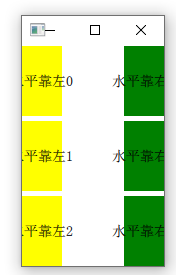
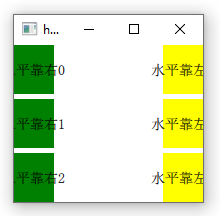
設定"flow: GridLayout.TopToBottom"、"layoutDirection: Qt. RightToLeft"的時候,效果如下所示(先繪製一列"yellow"、再繪製一列"green",然後再進行水平映象變換):
4.Layout.rowSpan和Layout.columnSpan介紹
用來指定item在網格中顯示的行跨度和列跨度,預設值為1.
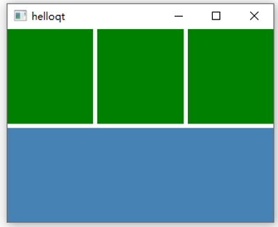
我們以每個網格的寬高為1為例,比如當前item預設顯示的區域是在(0,1)~(1,2)上:
000
X00
000
如果我們設定columnSpan=3, rowSpan=2,那麼當前item顯示的區域將是在(0,1)~(3,3)上面,也就是說列跨度(寬度)佔了3個網格,行寬度(高度)佔了2個網格,將會變為:
000
XXX
XXX
- 注意 : 使用跨度之前,必須設定Layout.fillWidth和Layout.fillHeight為true
示例如下所示:
Window {
    width: 320;
    height: 240;
    visible: true;

    GridLayout{
          id: grid
          columns: 3
          anchors.fill: parent

          Repeater {
            model: 3
            Rectangle {               // 顯示區域
                color: "green"
                Layout.fillWidth: true
                Layout.fillHeight: true
            }

          }
          Rectangle {               // 顯示區域
              color: "steelblue"
              Layout.fillWidth: true
              Layout.fillHeight: true
              Layout.columnSpan: 3
              Layout.rowSpan: 2
          }
    }
}
效果如下所示:
注意:
Layout.rowSpan和Layout.columnSpan有個bug,那就是如果我們定義的某一列的所有item如果都帶了相同的Layout.columnSpan值,那麼是沒有效果的,示例如下所示:
GridLayout{
              id: grid
              columns: 4
              anchors.fill: parent

              Rectangle {
                  color: "steelblue"
                  Layout.fillWidth: true
                  Layout.fillHeight: true
              }
              Rectangle {
                  color: "steelblue"
                  Layout.fillWidth: true
                  Layout.fillHeight: true
              }
              Rectangle {               // yellow區域
                  color: "yellow"
                  Layout.fillWidth: true
                  Layout.fillHeight: true
                  Layout.columnSpan: 2
              }
              Rectangle {
                  color: "steelblue"
                  Layout.fillWidth: true
                  Layout.fillHeight: true
                  Layout.columnSpan: 2
              }
              Rectangle {               // yellow區域
                  color: "yellow"
                  Layout.fillWidth: true
                  Layout.fillHeight: true
                  Layout.columnSpan: 2
              }
        }
效果如下所示:

可以看到我們設定yellow塊的是Layout.columnSpan: 2,但是顯示的效果並沒有跨列.這是因為我們最後一列沒有放置任何東西,所以它的位置被前面3列給均勻平攤了.
5.簡易的網站導航介面設計
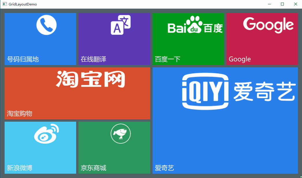
接下來我們便來通過GridLayout來做一個簡易的網站導航介面,並支援自適應介面.當我們點選其中的某個按鈕,就會開啟瀏覽器跳到對應的網站上.
介面如下所示: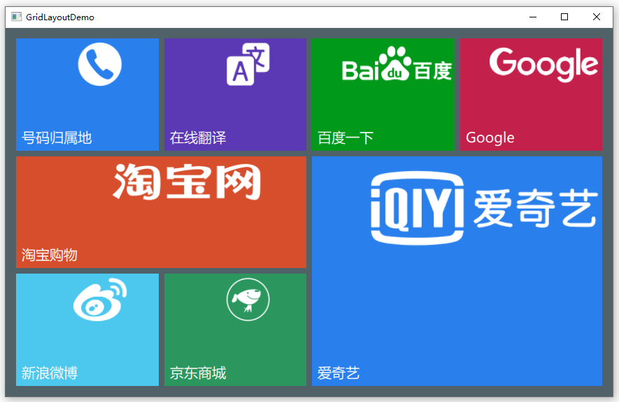
效果如下所示(支援自適應):
下載連結: https://download.csdn.net/download/qq_37997682/16796542
首先建立BoxButton元件:
import QtQuick 2.14
import QtQuick.Controls 2.0

Button {
    id: btn
    property var backColor: "#7BCBEB"
    property var iconUrl: ""
    property var textSize: 12
    property var openUrl: ""

    text: "button"
    implicitWidth: 60
    implicitHeight: 60
    hoverEnabled: true
    contentItem: Label {                    // 設定文字,文字位於左下角
        id: btnForeground
        text: parent.text
        font.family: "Microsoft Yahei"
        font.pixelSize: textSize
        color: "#FFFFFF"
        horizontalAlignment: Text.AlignLeft
        verticalAlignment: Text.AlignBottom
    }
    background: Rectangle {
        id: btnBack
        color: backColor
        border.color: backColor
        border.width: 2

    }

    Image{                              // 設定圖示,圖示位於右上角
        source: iconUrl
        anchors.right: parent.right
        anchors.top: parent.top
        smooth: true
        anchors.rightMargin: parent.width * 0.01
        anchors.topMargin: parent.height * 0.03
        fillMode: Image.PreserveAspectFit
        height: parent.height * 0.4
        width: parent.width * 0.8
        mipmap: true
    }

    onDownChanged: {
        btnBack.color = down ? Qt.lighter(backColor, 0.9) : backColor
        btnBack.border.color = backColor
    }
    onHoveredChanged: {
        btnBack.color = hovered ? Qt.lighter(backColor, 1.09) : backColor
        btnBack.border.color = hovered ? Qt.lighter(backColor, 1.24) : backColor

    }

    onClicked: {
        if (openUrl.length > 0) {
            Qt.openUrlExternally(openUrl);
        }

    }
}
然後在main.cpp來生成元件:
import QtQuick 2.14
import QtQuick.Window 2.0
import QtQuick.Layouts 1.14
Window {
    width: 800;
    height: 520;
    visible: true;
    color: "#506168"

    property var btnTextSize: Math.min(grid.height,grid.width) * 0.04

    function boxButtonInit(item,color,text,icon,url) {
        item.Layout.fillWidth = true
        item.Layout.fillHeight = true
        item.backColor = color
        item.text = text
        item.iconUrl = icon
        item.openUrl = url

    }

    GridLayout {
          id: grid
          columns: 4
          anchors.fill: parent
          anchors.margins: 15
          rowSpacing: 8
          columnSpacing: 8
          BoxButton {
              textSize : btnTextSize
              Component.onCompleted: boxButtonInit(this,
                                                   "#297FEC",
                                                   "號碼歸屬地",
                                                   "qrc:/phone.png",
                                                   "https://www.ip138.com/sj/");
          }
          BoxButton {
              textSize : btnTextSize
              Component.onCompleted: boxButtonInit(this,
                                                   "#5B39B4",
                                                   "線上翻譯",
                                                   "qrc:/translate.png",
                                                   "https://fanyi.baidu.com/");
          }
          BoxButton {
              textSize : btnTextSize
              Component.onCompleted: boxButtonInit(this,
                                                   "#00991A",
                                                   "百度一下",
                                                   "qrc:/baidu.png",
                                                   "https://www.baidu.com/");
          }
          BoxButton {
              textSize : btnTextSize
              Component.onCompleted: boxButtonInit(this,
                                                   "#C4204C",
                                                   "Google",
                                                   "qrc:/google.png",
                                                   "https://www.google.cn/");
          }
          BoxButton {
              Layout.columnSpan: 2
              textSize : btnTextSize
              Component.onCompleted: boxButtonInit(this,
                                                   "#D74E2C",
                                                   "淘寶購物",
                                                   "qrc:/tb.png",
                                                   "https://www.taobao.com/");

          }
          BoxButton {
              Layout.columnSpan: 2
              Layout.rowSpan: 2
              textSize : btnTextSize
              Component.onCompleted: boxButtonInit(this,
                                                   "#297FEC",
                                                   "愛奇藝",
                                                   "qrc:/aiyiqi.png",
                                                   "https://www.iqiyi.com/");
          }

          BoxButton {
              textSize : btnTextSize
              Component.onCompleted: boxButtonInit(this,
                                                   "#4CC8EF",
                                                   "新浪微博",
                                                   "qrc:/weibo.png",
                                                   "https://weibo.com/");
          }
          BoxButton {
              textSize : btnTextSize
              Component.onCompleted: boxButtonInit(this,
                                                   "#2B965E",
                                                   "京東商城",
                                                   "qrc:/jd.png",
                                                   "https://www.jd.com/");
          }
    }

    Component.onCompleted: {
        x = Screen.desktopAvailableWidth / 2 - width / 2
        y = Screen.desktopAvailableHeight / 2 - height / 2
    }

}