Android MD控制元件之CardView
原文地址:http://blog.csdn.net/whitley_gong/article/details/51170240
一、前言
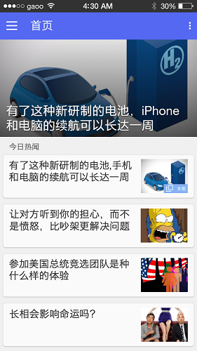
CardView是Android5.0中的一個全新控制元件,是一種卡片的檢視,就是知乎日報首頁的風格(下圖),從本質上看,可以將CardView看做是FrameLayout在自身之上新增了圓角和陰影效果。有了它,我們即便沒有特別好的美感,也可以做出效果很不錯的介面。
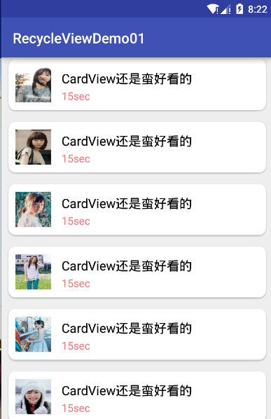
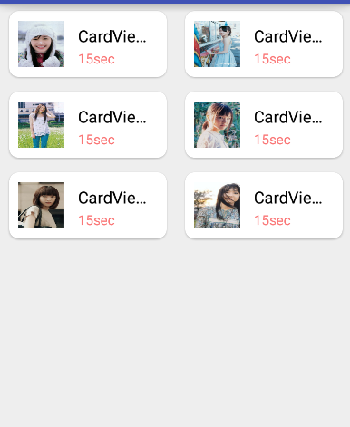
二、效果展示
一般來說,CardView是配合RecyclerView作為Item來使用的,用來顯示有層次的內容,或者列表和網格。那麼,想來看一下這個展示demo 的效果,還是很不錯的吧。
三、使用方法
Android Studio新增CardView引用
dependencies {
  compile 'com.android.support:cardview-v7:23.1.1'
}
Demo的item.xml佈局程式碼
<android.support.v7.widget.CardView xmlns:android="http://schemas.android.com/apk/res/android"
                                    xmlns:app="http://schemas.android.com/apk/res-auto"
                                    android:layout_width="match_parent"
                                    android:layout_height="wrap_content"
                                    android:layout_marginBottom="2dp"
                                    android:layout_marginLeft="5dp"
                                    android:layout_marginRight="5dp"
                                    android:layout_marginTop="2dp"
                                    app:cardBackgroundColor="#FFF"
                                    app:cardCornerRadius="10dp"
                                    app:cardUseCompatPadding="true"
                                    app:contentPadding="10dp"
                                    app:elevation="1dp">

    <LinearLayout
        android:id="@+id/ll_item_container"
        android:layout_width="match_parent"
        android:layout_height="match_parent"
        android:orientation="horizontal">

        <ImageView
            android:id="@+id/iv_item_icon"
            android:layout_width="50dp"
            android:layout_height="50dp"
            android:layout_gravity="center_vertical|left"
            android:layout_marginRight="15dp"
            android:background="@drawable/img1"
            />
        <LinearLayout
            android:layout_width="wrap_content"
            android:layout_height="wrap_content"
            android:orientation="vertical"
            android:layout_gravity="right"
            >

            <TextView
                android:id="@+id/tv_item_content"
                android:layout_width="match_parent"
                android:layout_height="wrap_content"
                android:text="CardView挺好看"
                android:singleLine="true"
                android:ellipsize="end"
                android:layout_marginTop="5dp"
                android:textColor="#000"
                android:textSize="18sp"
                />

            <TextView
                android:id="@+id/tv_item_duration"
                android:layout_width="match_parent"
                android:layout_height="wrap_content"
                android:gravity="center_vertical"
                android:text="15sec"
                android:layout_marginTop="2dp"
                android:textColor="#FFFA7777"
                android:textSize="15sp"
                />
        </LinearLayout>
    </LinearLayout>

</android.support.v7.widget.CardView>
其他可以暫時不用管它,這裡講一下使用到的CardView的幾個屬性:基本都是看到名字就知道意思了,剩下的後面會統一講。
cardBackgroundColor:設定card背景顏色
cardCornerRadius:設定卡片的圓角大小
contentPadding:設定卡片內容於邊距的間隔
cardUseCompatPadding:最需要注意的屬性,它在5.0以下的系統中預設是true, 但在5.0系統中預設為false,如果不設定 app:cardUseCompatPadding=”true”的話會造成在5.0系統的Android手機上不能看到陰影效果。
四、CardView屬性介紹
| 屬性名 | 功能 |
|---|---|
| android:cardCornerRadius | 設定card圓角的大小 |
| android:cardBackgroundColor | 設定card背景顏色 |
| android:elevation | 設定陰影的大小 |
| card_view:cardElevation | 設定card背景顏色 |
| card_view:cardMaxElevation | 設定card背景顏色 |
| card_view:contentPadding | 設定card背景顏色 |
| card_view:contentPaddingBottom | 設定卡片內容於下邊距的間隔 |
| card_view:contentPaddingTop | 設定卡片內容於上邊距的間隔 |
| card_view:contentPaddingLeft | 設定卡片內容於左邊距的間隔 |
| card_view:contentPaddingRight | 設定卡片內容於右邊距的間隔 |
| card_view:contentPaddingStart | 設定卡片內容於邊距的間隔起始 |
| card_view:contentPaddingEnd | 設定卡片內容於邊距的間隔終止 |
| card_view:cardUseCompatPadding | 設定內邊距,V21+的版本和之前的版本仍舊具有一樣的計算方式 |
| card_view:cardPreventConrerOverlap | 設定內邊距,在V20和之前的版本中新增內邊距,這個屬性為了防止內容和邊角的重疊 |
波紋點選效果:
開發中你可能需要使用到點選的波紋效果,預設情況,CardView是不可點選的,並且沒有任何的觸控反饋效果。
實現這種行為,必須提供一下屬性:android:clickable和android:foreground。
<android.support.v7.widget.CardView
  xmlns:android="http://schemas.android.com/apk/res/android"
  xmlns:card_view="http://schemas.android.com/apk/res-auto"
  ...
  android:clickable="true"
  android:foreground="?android:attr/selectableItemBackground">
  ...
</android.support.v7.widget.CardView>
-
對於在低版本中,設定了CardElevation後,CardView會自動留出空間供陰影顯示,但對於Android L版本,就需要手動設定Margin邊距來預留空間,這樣的結果就是在Android 5.0以上的手機上可以正常顯示,但對於Android 4.4.x的手機上就發現邊距很大,導致浪費了螢幕空間。
-
解決上面問題,需要我們做適配。可以在/res/value和/res/value-v21分別建立dimens.xml檔案,在dimens.xml裡,隨意命名,對於Android 5.0以上的設定數值0dp,對於Android 5.0以下的設定數值(根據實際需求)。這樣就解決低版本中邊距過大或者視覺效果不好的問題了。
五、總結和原始碼下載:
基本上CardView的使用就到這裡了,至於這裡用到的RecyclerView的使用會在後面的文章中繼續更新,敬請期待!
原始碼下載
相關文章
- CardView 控制元件的使用方式View控制元件
- Android 《CardView 屬性》AndroidView
- Android資料加密之MD5加密Android加密
- Material Design 系列之 CardView、FAB 和 SnackbarMaterial DesignView
- CardView的使用View
- Android自定義控制元件之自定義組合控制元件Android控制元件
- Android開發之Spinner控制元件使用Android控制元件
- android之 控制元件常用的屬性Android控制元件
- Android 使用 CardView 輕鬆實現卡片式設計AndroidView
- Android CardView 開發過程中要注意的細節AndroidView
- Android大檔案上傳秒傳之MD5篇Android
- 【ASM】ASMCMD 之md_backup,md_restore介紹ASMREST
- android之豎直滾動控制元件-ListViewAndroid控制元件View
- Android控制元件之ConstraintLayout詳解Android控制元件AI
- 【組合控制元件】android自定義控制元件之帶文字的ImageView控制元件AndroidView
- Android自定義控制元件之基本原理Android控制元件
- Android自定義控制元件之自定義屬性Android控制元件
- Android自定義控制元件系列之基礎篇Android控制元件
- 已開源!一款支援鴻蒙 NEXT Android iOS 的 UI 控制元件檢視器.md鴻蒙AndroidiOSUI控制元件
- Android之改變控制元件的背景及形態Android控制元件
- CardView改變陰影顏色View
- CardView原始碼解析-View陰影View原始碼
- Android自定義組合控制元件之自定義屬性Android控制元件
- Android列表控制元件Android控制元件
- Android 分享控制元件Android控制元件
- Android:TextView控制元件AndroidTextView控制元件
- android:Button控制元件Android控制元件
- android:EditText控制元件Android控制元件
- Android:ImageView控制元件AndroidView控制元件
- android:ProgressBar控制元件Android控制元件
- MD5之學習筆記筆記
- Android開發之自定義隨機驗證碼控制元件Android隨機控制元件
- 【安卓筆記】CardView+RecyclerView使用示例安卓筆記View
- android:AlertDialog控制元件Android控制元件
- android:ProgressDialog控制元件Android控制元件
- Android 從0開始自定義控制元件之 ViewRoot 與 DecorView (五)Android控制元件View
- Android自定義控制元件之實現一個球賽比分條Android控制元件
- Android開發之RadioGroup與RadioButton控制元件使用Android控制元件