(譯)使用CoordinatorLayout處理滾動
原文連結:Handling Scrolls with CoordinatorLayout
概述
CoordinatorLayout可以完成很多Google的 Material Design滾動效果。目前,框架中提供了幾種方法讓它工作並且你不需要自己寫動畫程式碼。
這些效果包括:
- 為Snackbar提供空間向上和向下滑動Floating Action Button。
- 擴大或收縮Toolbar或header的空間為主要內容提供空間。
- 控制View應該以什麼樣的速率擴充套件或收縮,包括視差滾動效果動畫。

示例程式碼
來自Google的Chris Banes已經做出了CoordinatorLayout的漂亮的demo和design
support library的其它特性。
完整原始碼可以從github上找到。這個工程可以很容易理解CoordinatorLayout。
配置
確保根據Design Support Library說明進行配置。
Floating Action Buttons 和 Snackbars
CoordinatorLayout可以通過layout_anchor和layout_gravity屬性建立浮動效果。檢視Floating
Action Buttons使用指南獲取更多資訊。
當Snackbar被渲染,它通常出現在螢幕底部。為了顯示,FAB必須向上移動提供空間。
只要CoordinatorLayout作為佈局的根節點,這個動畫效果會自動出現。FAB有一個預設的行為會檢查Snackbar被新增並且動畫向上移動Snackbar的高度。
1 |
<android.support.design.widget.CoordinatorLayout |
擴充套件或收縮Toolbars
首先需要確保沒有使用被棄用的ActionBar。確保根據使用Toolbar作為ActionBar進行配置。也確保CoordinatorLayout作為主要佈局容器。
1 |
<android.support.design.widget.CoordinatorLayout xmlns:android="http://schemas.android.com/apk/res/android" |
響應滾動事件
下一步,我們必須使用一個名為AppBarLayout的容器佈局讓Toolbar響應滾動事件:
1 |
<android.support.design.widget.AppBarLayout |
注意:根據Google官方文件AppBarLayout應該作為巢狀在CoordinatorLayout中的直接子View。
然後,我們需要定義AppBarLayout和可以滾動的View之間的關係。給RecyclerView或其它可以巢狀滾動的View例如NestedScrollView新增一個app:layout_behavior屬性。support
library包含一個特殊的字串資源@string/appbar_scrolling_view_behavior對應AppBarLayout.ScrollingViewBehavior,用於在指定View上發生滾動事件時通知AppBarLayout。這個行為(behavior)必須放在觸發事件的View上。
1 |
<android.support.v7.widget.RecyclerView |
當CoordinatorLayout注意到這個屬性宣告在RecyclerView上,它會根據behavior搜尋被包含的任何有關係的其它View。在這種情況下,AppBarLayout.ScrollingViewBehavior描述了RecyclerView和AppBarLayout之間的依賴。RecyclerView的任何滾動事件都會觸發AppBarLayout或包含在它之內的佈局改變。
RecyclerView的滾動事件會觸發在AppBarLayout內宣告瞭app:layout_scrollFlags屬性的View改變:
1 |
<android.support.design.widget.AppBarLayout |
對於任何由滾動效果引起的效果必須在app:layout_scrollFlags屬性中使用scroll標誌。這個標誌必須和enterAlways,enterAlwaysCollapsed,exitUntilCollapsed,或snap配合使用:
-
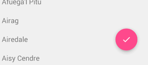
enterAlways:當向上滾動時View將可見。這個標誌對於從列表底部滾動並且想當向上滾動時儘快顯示Toolbar這種情況是非常有用的。
正常情況下,Toolbar只會在列表滑動到頂部才會出現正如下圖所示:
-
enterAlwaysCollapsed:正常情況下,當只使用了enterAlways,當向下滑動Toolbar會繼續展開:
假設宣告瞭enterAlways並且指定了minHeight,你也可以指定enterAlwaysCollapsed。當配置了這個,View只會在最小高度出現。當滑動到頂部View會展開完整高度:
exitUntilCollapsed:當設定了scroll標誌,向下滾動將導致整個內容的移動:

通過指定minHeight和exitUntilCollapsed,到達Toolbar的最小高度之前剩下的內容開始滾動並退出螢幕:

snap:使用這個選項將決定當一個View只減少一部分時做什麼。當滾動結束並且減少的View的大小比它原先大小的50%小,這個View會返回到它原先的大小,如果比它大小的50%大,它會完全消失。

注意:記住首先給所有的View設定scroll標誌。這樣的話,View退出前產生視差在頂部留下固定元素。
這時候,你應該注意到了Toolbar響應了滾動事件。
建立收縮效果
如果我們想建立toolbar收縮效果,我們必須把Toolbar放到CollapsingToolbarLayout中:
1 |
<android.support.design.widget.AppBarLayout |
出現的結果將會是:
正常情況下,我們給Toolbar設定title。現在我們需要給CollapsingToolBarLayout設定title而不是Toolbar。
1 |
CollapsingToolbarLayout collapsingToolbar = |
注意當使用CollapsingToolbarLayout時,狀態列應該設定為translucent
(API 19) 或 transparent (API 21) 正如這個檔案所示。特別是,應該在res/values-xx/styles.xml設定為下面的樣式:
1 |
<!-- res/values-v19/styles.xml --> |
通過如上所示開啟透明系統條,佈局將會填充系統條後面的區域,因此你也必須為不應該被系統條覆蓋的部分佈局開啟android:fitsSystemWindow。對於API
19還可以通過新增padding去避免狀態條裁剪View,可以從這找到。
建立視差動畫
CollapsingToolbarLayout也可以為我們做更高階的動畫,例如當它摺疊時使一個圖片逐漸消失。Title也可以隨著使用者的滑動改變高度。

為了建立這個效果,我們新增一個ImageView並宣告一個app:layout_collapseMode="parallax"屬性。
1 |
<android.support.design.widget.CollapsingToolbarLayout |
Bottom Sheets
Bottom Sheets 在 support design library v23.2 中提供支援。支援兩種型別的bottom sheets:固定(persistent) 和 模態(modal)。固定的bottom sheets顯示應用中的內容,modal sheets顯示一個選單或簡單的對話方塊。
圖 Persistent Modal Sheets(譯者加)
圖 Modal Sheets(譯者加)
PERSISTENT MODAL SHEETS
這有兩種方法建立persistent modal sheets。第一種方法是使用一個NestedScrollView,然後把內容放到這個View中。第二種方法是使用一個RecyclerView嵌入到CoordinatorLayout中。如果layout_behavior使用的是預定義的@string/bottom_sheet_behavior值,那RecyclerView預設會隱藏。注意RecyclerView應該使用wrap_content而不是match_parent,這可以讓bottom
sheet只出現在必要的空間而不是整個頁面:
1 |
<CoordinatorLayout> |
然後建立RecyclerView的元素。我們建立一個簡單的Item包含一張圖片和一個文字。
1 |
public class Item { |
然後建立adapter:
1 |
public class ItemAdapter extends RecyclerView.Adapter<ItemAdapter.ViewHolder> { |
bottom sheet預設情況下應該是隱藏的。我們需要點選事件觸發顯示和隱藏。注意: 不要嘗試在OnCreate()方法展開bottom
sheet因為這個已知問題。
1 |
RecyclerView recyclerView = (RecyclerView) findViewById(R.id.design_bottom_sheet); |
你可以設定一個app:behavior_hideable=true佈局屬性允許使用者滑動bottom
sheet隱藏。這還有其它的狀態包括:STATE_DRAGGING,STATE_SETTLING和STATE_HIDDEN。想要擴充套件閱讀,你也可以看看另一篇bottom
sheet教程。
MODAL SHEETS
Modal sheets基於Dialog Fragments可以從底部滑動。檢視這篇指南學習怎樣建立這些型別的fragments。不是繼承自DialogFragment,應該繼承BottomSheetDialogFragment。
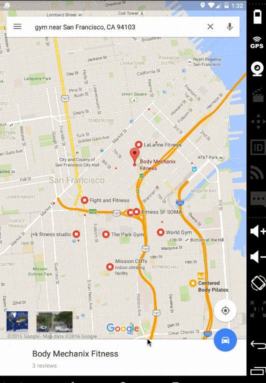
高階BOTTOM SHEET示例
這有很多帶有一個FAB複雜的bottom sheets的例子,可以跟隨使用者的滑動展開或收縮或狀態過渡。最知名的例子就是Google地圖的多相sheet:
下面的教程和示例應該可以幫助實現更復雜的效果:
- CustomBottomSheetBehavior Sample——演示了滑動bottom sheet時三態的改變。詳細說明參考related stackoverflow post。
- Grafixartist Bottom Sheet Tutorial——關於bottom sheet滑動時怎樣移動FAB的位置的教程。
- 你可以看看stackoverflow post關於怎樣實現Google地圖滾動時修改狀態。
多多實驗才能獲取預期的效果。對於特定用例,你可以從下面列出的第三方類庫中選擇。
可選擇的第三方BOTTOM SHEET
除了官方在design support library中提供的bottom sheet,這有幾個非常受歡迎的可選擇的第三方的類庫,對於特定用例很方便使用和配置:
下面為最常見的選擇和相關例子:
- AndroidSlidingUpPanel——廣受歡迎的實現bottom sheet的方法被認為是最接近官方方法的選擇。
- Flipboard/bottomsheet——除官方bottom sheet外另一個非常受歡迎的類庫,在官方解決方案發布之前被廣泛使用。
- ThreePhasesBottomSheet——利用第三方類庫建立多相bottom sheet的示例程式碼。
- Foursquare BottomSheet Tutorial——概述了怎樣使用第三方bottom sheets在Foursquare老版本中實現對應效果。
學習官方persistent modal sheets和第三方類庫的實現,通過足夠的實驗你應該能實現任何你想要的效果。
Coordinated Layouts常見問題
CoordinatorLayout很強大但剛開始很容易出錯。如果你在使用過程中出現了問題,請檢視下面的提示:
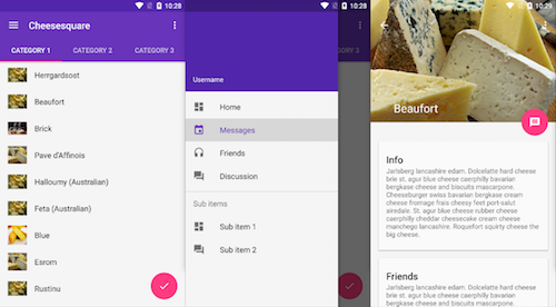
- 怎樣有效地使用coordinator layout最好的例子是參考cheesesquare原始碼。這個倉庫是Google保持更新的示例倉庫代表coordinating behaviors的最佳實踐。尤其是檢視ViewPager list佈局和詳情頁佈局。拿你的原始碼和cheesesquare原始碼進行比較。
- 確保
app:layout_behavior="@string/appbar_scrolling_view_behavior"屬性應用到了CoordinatorLayout的 直接子View。例如,這有一個下拉重新整理佈局SwipeRefreshLayout中包含一個RecyclerView,這個屬性應該應用到SwipeRefreshLayout而不是第二級子ViewRecyclerView。 - 當coordinating發生在一個
ViewPager包含fragment作為item的list和parent activity之間,你應該把app:layout_behavior屬性放在ViewPager上(正如這個檔案所示),因此pager內的滾動是向上突出的並且可以通過CoordinatorLayout進行管理。注意你 不應該 把app:layout_behavior屬性放到fragment或list中的任何地方。 - 注意
ScrollView無法和CoordinatorLayout配合使用。你需要使用NestedScrollView代替就像這個例子所示。把你的內容放到NestedScrollView中並且應用app:layout_behavior屬性可以得到預期的效果。 - 確保你的activity或fragment的根佈局是
CoordinatorLayout。滾動不會響應到其它任何佈局。
導致coordinating layouts出錯的原因有很多種。當你遇到了請新增提示到這裡。
自定義Behaviors
我們已經在CoordinatorLayout with Floating Action Buttons中討論過一個自定義Behaviors的例子。
CoordinatorLayout是通過搜尋在XML中定義了app:layout_behavior屬性或者在View類中新增@DefaultBehavior註解包含CoordinatorLayout
Behavior工作的。當發生滾動事件,CoordinatorLayout會嘗試觸發作為依賴宣告的其它子View。
對於自定義CoordinatorLayout Behavior,應該實現layoutDependsOn() 和 onDependentViewChanged()。例如,AppBarLayout.Behavior定義了兩個關鍵方法。這個behavior用於當滾動事件發生時觸發AppBarLayout的改變。
1 |
public boolean layoutDependsOn(CoordinatorLayout parent, View child, View dependency) { |
理解怎樣實現這些自定義行為最好的辦法就是學習AppBarLayout.Behavior和FloatingActionButtion.Behavior的例子。
第三方滾動和視差
除了向上面所說使用CoordinatorLayout,你也可以看看這些受歡迎的第三方類庫對ScrollView,ListView,ViewPager和RecyclerView的滾動視差效果。
在AppBarLayout中引入Google地圖
在這個issue已經明確目前無法在AppBarLayout中支援Google
Maps fragment。support design library v23.1.0中提供了setOnDragListener()方法,如果在佈局中需要拖拽效果這將會很有用。然而,正如這篇文章所說它並不會影響滾動。
參考
相關文章
- 用 CoordinatorLayout 處理滾動
- CoordinatorLayout與滾動的處理
- OverScroll彈性滾動和慣性滾動效果的實現原理——CoordinatorLayout+Behavior
- selenium中JS如何處理滾動條JS
- 使用 CoordinatorLayout 實現複雜聯動效果
- [譯] 使用 Catcher 處理 Flutter 錯誤Flutter
- Oracle提交和回滾處理Oracle
- [譯] Elasticsearch 滾動升級Elasticsearch
- android CoordinatorLayout使用Android
- 【譯】定製Flutter滾動效果Flutter
- [譯]使用 Siesta 處理 Swift 網路請求Swift
- 回滾段完蛋了的處理
- 20 個用於處理頁面滾動效果的 jQuery 外掛jQuery
- [譯] 使用智慧 CSS 基於使用者滾動位置應用樣式CSS
- win10系統iframe滾動條閃動怎麼處理_win10系統iframe滾動條閃動如何修復Win10
- echarts圖表漸變色 、及X軸滾動條樣式處理Echarts
- [譯] 使用 Angular 和 RxJS 實現的無限滾動載入AngularJS
- 回滾段表空間損壞處理(ORA-01552)處理方法
- 使用批處理重新啟動計算機計算機
- [譯] 如何使用純函式式 JavaScript 處理髒副作用函式JavaScript
- 「譯」使用 System.Net.Http.Json 高效處理JsonHTTPJSON
- 【譯】RxJava 中的錯誤處理RxJava
- [譯] 自然語言處理真是有趣!自然語言處理
- 使用CoordinatorLayout過程中遇到的兩個問題以及淺析CoordinatorLayout工作機制
- 使用js控制滾動條的位置JS
- 使用CSS隱藏元素滾動條CSS
- 使用Hive處理WordCountHive
- [譯] Go 1.13 errors 包錯誤處理GoError
- [譯] Part 30: Golang 中的Error處理GolangError
- [翻譯]-異常處理最佳實踐
- 用批處理來自動化專案編譯及部署(附Demo)編譯
- div滾動條樣式,水平滾動
- 隱藏滾動條保留滾動效果
- RecyclerView滾動位置,滾動速度設定View
- #翻譯#使用註解處理器生成程式碼-1 註解型別型別
- js如何實現將滾動條處於最下端JS
- 使用 flutter 的ListView實現滾動列表FlutterView
- css隱藏滾動條並可以滾動CSS