如何使用 Python 建立一個 NBA 得分圖?
本文意在建立一個得分圖,該圖同時描繪了從場上不同位置投籃得分的百分比和投籃次數,這和 Austin Clemen 個人網站上的帖子 http://www.austinclemens.com/shotcharts/ 類似 。
為了實現這個得分圖,筆者參考了 Savvas Tjortjoglou 的帖子 http://savvastjortjoglou.com/nba-shot-sharts.html。這篇帖子很棒,但是他只描述了從不同位置投籃的次數。而筆者對在不同位置的投籃次數和進球百分比都很感興趣,所以還需要進一步的工作,在原有基礎上新增些東西,下面是實現過程。
```
import some libraries and tell ipython we want inline figures rather than interactive figures.
%matplotlib inline import matplotlib.pyplot as plt, pandas as pd, numpy as np, matplotlib as mpl ```
首先,我們需要獲得每個球員的投籃資料。利用 Savvas Tjortjoglou 貼出的程式碼,筆者從 NBA.com 網站 API 上獲取了資料。在此不會貼出這個函式的結果。如果你感興趣,推薦你去看看 Savvas Tjortjoglou 的部落格。
def aqcuire_shootingData(PlayerID,Season):
    import requests
    shot_chart_url = 'http://stats.nba.com/stats/shotchartdetail?CFID=33&CFPARAMS='+Season+'&ContextFilter='\
                    '&ContextMeasure=FGA&DateFrom=&DateTo=&GameID=&GameSegment=&LastNGames=0&LeagueID='\
                    '00&Location=&MeasureType=Base&Month=0&OpponentTeamID=0&Outcome=&PaceAdjust='\
                    'N&PerMode=PerGame&Period=0&PlayerID='+PlayerID+'&PlusMinus=N&Position=&Rank='\
                    'N&RookieYear=&Season='+Season+'&SeasonSegment=&SeasonType=Regular+Season&TeamID='\
                    '0&VsConference=&VsDivision=&mode=Advanced&showDetails=0&showShots=1&showZones=0'
    response = requests.get(shot_chart_url)
    headers = response.json()['resultSets'][0]['headers']
    shots = response.json()['resultSets'][0]['rowSet']
    shot_df = pd.DataFrame(shots, columns=headers)
    return shot_df
接下來,我們需要繪製一個包含得分圖的籃球場圖。該籃球場圖例必須使用與NBA.com API 相同的座標系統。例如,3分位置的投籃距籃筐必須為 X 單位,上籃距離籃筐則是 Y 單位。同樣,筆者再次使用了 Savvas Tjortjoglou 的程式碼(哈哈,否則的話,搞明白 NBA.com 網站的座標系統肯定會耗費不少的時間)。
```
def draw_court(ax=None, color='black', lw=2, outer_lines=False):
from matplotlib.patches import Circle, Rectangle, Arc
if ax is None:
ax = plt.gca()
hoop = Circle((0, 0), radius=7.5, linewidth=lw, color=color, fill=False)
backboard = Rectangle((-30, -7.5), 60, -1, linewidth=lw, color=color)
outer_box = Rectangle((-80, -47.5), 160, 190, linewidth=lw, color=color,
fill=False)
inner_box = Rectangle((-60, -47.5), 120, 190, linewidth=lw, color=color,
fill=False)
top_free_throw = Arc((0, 142.5), 120, 120, theta1=0, theta2=180,
linewidth=lw, color=color, fill=False)
bottom_free_throw = Arc((0, 142.5), 120, 120, theta1=180, theta2=0,
linewidth=lw, color=color, linestyle='dashed')
restricted = Arc((0, 0), 80, 80, theta1=0, theta2=180, linewidth=lw,
color=color)
corner_three_a = Rectangle((-220, -47.5), 0, 140, linewidth=lw,
color=color)
corner_three_b = Rectangle((220, -47.5), 0, 140, linewidth=lw, color=color)
three_arc = Arc((0, 0), 475, 475, theta1=22, theta2=158, linewidth=lw,
color=color)
center_outer_arc = Arc((0, 422.5), 120, 120, theta1=180, theta2=0,
linewidth=lw, color=color)
center_inner_arc = Arc((0, 422.5), 40, 40, theta1=180, theta2=0,
linewidth=lw, color=color)
court_elements = [hoop, backboard, outer_box, inner_box, top_free_throw,
bottom_free_throw, restricted, corner_three_a,
corner_three_b, three_arc, center_outer_arc,
center_inner_arc]
if outer_lines:
outer_lines = Rectangle((-250, -47.5), 500, 470, linewidth=lw,
color=color, fill=False)
court_elements.append(outer_lines)
for element in court_elements:
    ax.add_patch(element)

ax.set_xticklabels([])
ax.set_yticklabels([])
ax.set_xticks([])
ax.set_yticks([])
return ax
```
我想創造一個不同位置的投籃百分比陣列,因此決定利用 matplot 的 Hexbin 函式 http://matplotlib.org/api/pyplot_api.html 將投籃位置均勻地分組到六邊形中。該函式會對每個六邊形中每一個位置的投籃次數進行計數。
六邊形是均勻的分佈在 XY 網格中。「gridsize」變數控制六邊形的數目。「extent」變數控制第一個和最後一個六邊形的繪製位置(一般來說第一個六邊形的位置基於第一個投籃的位置)。
計算命中率則需要對每個六邊形中投籃的次數和投籃得分次數進行計數,因此筆者對同一位置的投籃和得分數分別執行 hexbin 函式。然後,只需用每個位置的進球數除以投籃數。
``` def find_shootingPcts(shot_df, gridNum): x = shot_df.LOC_X[shot_df['LOC_Y']<425.1] #i want to make sure to only include shots I can draw y = shot_df.LOC_Y[shot_df['LOC_Y']<425.1]
x_made = shot_df.LOC_X[(shot_df['SHOT_MADE_FLAG']==1) & (shot_df['LOC_Y']<425.1)]
y_made = shot_df.LOC_Y[(shot_df['SHOT_MADE_FLAG']==1) & (shot_df['LOC_Y']<425.1)]

#compute number of shots made and taken from each hexbin location
hb_shot = plt.hexbin(x, y, gridsize=gridNum, extent=(-250,250,425,-50));
plt.close() #don't want to show this figure!
hb_made = plt.hexbin(x_made, y_made, gridsize=gridNum, extent=(-250,250,425,-50),cmap=plt.cm.Reds);
plt.close()

#compute shooting percentage
ShootingPctLocs = hb_made.get_array() / hb_shot.get_array()
ShootingPctLocs[np.isnan(ShootingPctLocs)] = 0 #makes 0/0s=0
return (ShootingPctLocs, hb_shot)
```
筆者非常喜歡 Savvas Tjortjoglou 在他的得分圖中加入了球員頭像的做法,因此也順道用了他的這部分程式碼。球員照片會出現在得分圖的右下角。
def acquire_playerPic(PlayerID, zoom, offset=(250,400)):
    from matplotlib import  offsetbox as osb
    import urllib
    pic = urllib.urlretrieve("http://stats.nba.com/media/players/230x185/"+PlayerID+".png",PlayerID+".png")
    player_pic = plt.imread(pic[0])
    img = osb.OffsetImage(player_pic, zoom)
    #img.set_offset(offset)
    img = osb.AnnotationBbox(img, offset,xycoords='data',pad=0.0, box_alignment=(1,0), frameon=False)
    return img
筆者想用連續的顏色圖來描述投籃進球百分比,紅圈越多代表著更高的進球百分比。雖然「紅」顏色圖示效果不錯,但是它會將0%的投籃進球百分比顯示為白色http://matplotlib.org/users/colormaps.html,而這樣顯示就會不明顯,所以筆者用淡粉紅色代表0%的命中率,因此對紅顏色圖做了下面的修改。
```
cmap = plt.cm.Reds
cdict = cmap._segmentdata
cdict = { 'blue': [(0.0, 0.6313725709915161, 0.6313725709915161), (0.25, 0.4470588266849518, 0.4470588266849518), (0.5, 0.29019609093666077, 0.29019609093666077), (0.75, 0.11372549086809158, 0.11372549086809158), (1.0, 0.05098039284348488, 0.05098039284348488)], 'green': [(0.0, 0.7333333492279053, 0.7333333492279053), (0.25, 0.572549045085907, 0.572549045085907), (0.5, 0.4156862795352936, 0.4156862795352936), (0.75, 0.0941176488995552, 0.0941176488995552), (1.0, 0.0, 0.0)], 'red': [(0.0, 0.9882352948188782, 0.9882352948188782), (0.25, 0.9882352948188782, 0.9882352948188782), (0.5, 0.9843137264251709, 0.9843137264251709), (0.75, 0.7960784435272217, 0.7960784435272217), (1.0, 0.40392157435417175, 0.40392157435417175)] }
mymap = mpl.colors.LinearSegmentedColormap('my_colormap', cdict, 1024) ```
好了,現在需要做的就是將它們合併到一塊兒。下面所示的較大函式會利用上文描述的函式來建立一個描述投籃命中率的得分圖,百分比由紅圈表示(紅色越深 = 更高的命中率),投籃次數則由圓圈的大小決定(圓圈越大 = 投籃次數越多)。需要注意的是,圓圈在交疊之前都能增大。一旦圓圈開始交疊,就無法繼續增大。
在這個函式中,計算了每個位置的投籃進球百分比和投籃次數。然後畫出在該位置投籃的次數(圓圈大小)和進球百分比(圓圈顏色深淺)。
``` def shooting_plot(shot_df, plot_size=(12,8),gridNum=30): from matplotlib.patches import Circle x = shot_df.LOC_X[shot_df['LOC_Y']<425.1] y = shot_df.LOC_Y[shot_df['LOC_Y']<425.1]
#compute shooting percentage and # of shots
(ShootingPctLocs, shotNumber) = find_shootingPcts(shot_df, gridNum)

#draw figure and court
fig = plt.figure(figsize=plot_size)#(12,7)
cmap = mymap #my modified colormap
ax = plt.axes([0.1, 0.1, 0.8, 0.8]) #where to place the plot within the figure
draw_court(outer_lines=False)
plt.xlim(-250,250)
plt.ylim(400, -25)

#draw player image
zoom = np.float(plot_size[0])/(12.0*2) #how much to zoom the player's pic. I have this hackily dependent on figure size
img = acquire_playerPic(PlayerID, zoom)
ax.add_artist(img)

#draw circles
for i, shots in enumerate(ShootingPctLocs):
    restricted = Circle(shotNumber.get_offsets()[i], radius=shotNumber.get_array()[i],
                        color=cmap(shots),alpha=0.8, fill=True)
    if restricted.radius > 240/gridNum: restricted.radius=240/gridNum
    ax.add_patch(restricted)

#draw color bar
ax2 = fig.add_axes([0.92, 0.1, 0.02, 0.8])
cb = mpl.colorbar.ColorbarBase(ax2,cmap=cmap, orientation='vertical')
cb.set_label('Shooting %')
cb.set_ticks([0.0, 0.25, 0.5, 0.75, 1.0])
cb.set_ticklabels(['0%','25%', '50%','75%', '100%'])

plt.show()
return ax
```
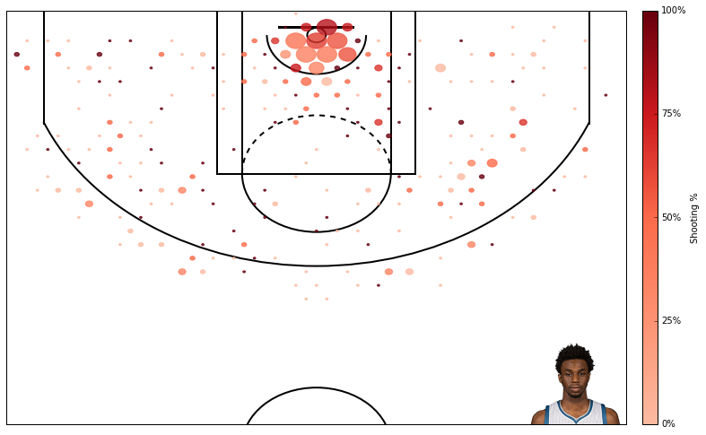
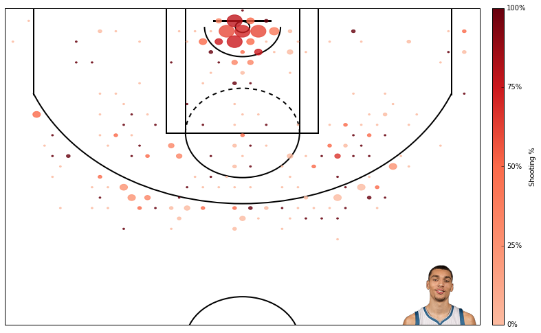
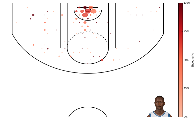
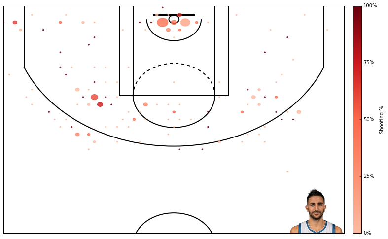
好了,大功告成!因為筆者是森林狼隊的粉絲,在下面用幾分鐘跑出了森林狼隊前六甲的得分圖。
PlayerID = '203952' #andrew wiggins
shot_df = aqcuire_shootingData(PlayerID,'2015-16')
ax = shooting_plot(shot_df, plot_size=(12,8));
PlayerID = '1626157' #karl anthony towns
shot_df = aqcuire_shootingData(PlayerID,'2015-16')
ax = shooting_plot(shot_df, plot_size=(12,8));

PlayerID = '203897' #zach lavine
shot_df = aqcuire_shootingData(PlayerID,'2015-16')
ax = shooting_plot(shot_df, plot_size=(12,8));
PlayerID = '203476' #gorgui deing
shot_df = aqcuire_shootingData(PlayerID,'2015-16')
ax = shooting_plot(shot_df, plot_size=(12,8));
PlayerID = '2755' #kevin martin
shot_df = aqcuire_shootingData(PlayerID,'2015-16')
ax = shooting_plot(shot_df, plot_size=(12,8));

PlayerID = '201937' #ricky rubio
shot_df = aqcuire_shootingData(PlayerID,'2015-16')
ax = shooting_plot(shot_df, plot_size=(12,8));
使用 hexbin 函式也是有隱患的,第一它並沒有解釋由於三分線而導致的非線性特性(一些 hexbin 函式同時包括了2分和3分的投籃)。它很好的限定了一些視窗來進行3分投籃,但如果沒有這個位置的硬編碼就沒有辦法做到這一點。此外 hexbin 方法的一個優點與是可以很容易地改變視窗的數量,但不確定是否可以同樣靈活的處理2分投籃和3分投籃。
另外一個隱患在於此圖將所有投籃都一視同仁,這相當不公平。在禁區投籃命中40%和三分線後的投籃命中40%可是大不相同。Austin Clemens 的解決辦法是將命中率與聯賽平均分關聯。也許過幾天筆者也會實現與之類似的功能。
原文 Creating NBA Shot Charts 作者 Dan Vatterott ,本文由 OneAPM 工程師編譯整理。
OneAPM 能夠幫你檢視 Python 應用程式的方方面面,不僅能夠監控終端的使用者體驗,還能監控伺服器效能,同時還支援追蹤資料庫、第三方 API 和 Web 伺服器的各種問題。想閱讀更多技術文章,請訪問 OneAPM 官方技術部落格。 本文轉自 OneAPM 官方部落格
相關文章
- 如何建立一個完美的 Python 專案Python
- 使用Python建立一個系統監控程式Python
- 如何用python建立詞雲圖片Python
- javascript如何建立一個物件JavaScript物件
- Python進階丨如何建立你的第一個Python元類?Python
- 使用angular建立一個serviceAngular
- 使用PHP建立一個SSEPHP
- 使用 Python 和 Scribus 建立一個 RGB 立方體Python
- 如何使用 Python 建立一名可操控的角色玩家Python
- 如何使用eclipse軟體建立一個Java專案?EclipseJava
- 如何使用gohugo/hugo建立一個靜態網站?Go網站
- 在Linux中,如何建立一個新使用者?Linux
- 如何使用 Arduino 製作一個繪圖儀UI繪圖
- 如何使用python做一個聊天小程式?Python
- JavaScript如何使用圖表工具FusionCharts建立雷達圖JavaScript
- python - 建立一個自定義模組Python
- Python 建立一個Django專案PythonDjango
- 推薦如何建立一個MAILLISTAI
- 如何建立一個 WordPress 網站網站
- 使用 Python 組合 NBA 球星卡Python
- 使用 Python 迴圈建立多個列表Python
- 如何使用Python建立AI虛擬助手PythonAI
- 如何使用SAP Cloud Application Studio建立一個PDF formCloudAPPORM
- PHP建立一個炫酷的圖表PHP
- 【Python】【001】建立第一個 FlaskPythonFlask
- [譯 ] 如何使用 AJAX 和 REST API 建立一個圖表(How To Make A Chart Using AJAX & REST API's)RESTAPI
- 如何建立一個“純淨”的物件物件
- 如何免費建立一個網站?網站
- javascript如何建立一個物件例項JavaScript物件
- javascript如何建立一個文字節點JavaScript
- JVM是如何建立一個物件的?JVM物件
- 如何使用 Zend Expressive 建立 NASA 圖片庫?Express
- 如何使用 XYZ 軟體建立複雜圖形
- 如何在Windows上使用Git建立一個可執行指令碼?WindowsGit指令碼
- 如何用 Python 和 Flask 建立部署一個 Facebook Messenger 機器人PythonFlaskMessenger機器人
- 機器學習一週心得分享機器學習
- 如何使用Python編寫一個Lisp直譯器PythonLisp
- 【Flutter】如何優美地實現一個懸浮NavigationBarFlutterNavigation