html5--6-55 動畫效果-關鍵幀動畫
例項
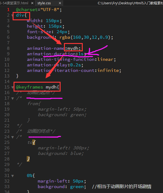
 1 @charset="UTF-8";
 2 div{
 3     width: 150px;
 4     height: 150px;
 5     font-size: 24px;
 6     background: rgba(160,30,12,0.9);
 7
 8     animation-name:mydh;
 9     animation-duration:1s;
10     animation-timing-function:linear;
11     animation-delay:0.2s;
12     animation-iteration-count:infinite;
13 }
14
15 @keyframes mydh{
16 /*    動畫的起點*/
17 /*
18     from{
19         margin-left: 50px;
20         background: green;
21     }
22 */
23 /*    動畫的終點*/
24 /*
25     to{
26         margin-left: 300px;
27         background: blue;
28     }
29 */
30
31     0%{
32         margin-left: 50px;
33         background: green;    //相當於動畫影片的開場劇情
34     }
35
36
37
38
39     100%{
40         margin-left: 300px; //相當於動畫影片的大結局
41         background: blue;
42     }
43 }
 1 <!DOCTYPE html>
 2 <html lang="zh-cn">
 3 <head>
 4     <meta charset="utf-8">
 5     <title>6-54課堂演示</title>
 6     <link rel="stylesheet" type="text/css" href="style.css">
 7 </head>
 8 <body>
 9       <div>關鍵幀動畫</div>
10 </body>
11 </html>
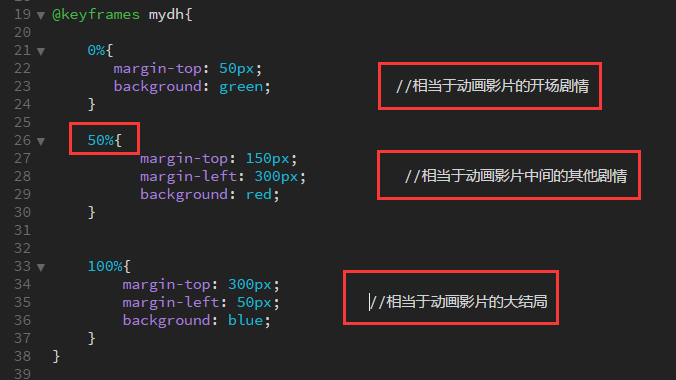
 1 @charset="UTF-8";
 2
 3 div{
 4     width: 150px;
 5     height: 150px;
 6     font-size: 24px;
 7     background: rgba(160,30,12,0.9);
 8     animation: mydh 2s ease 0s 2 alternate;
 9
10 /*    animation-name:mydh;
11     animation-duration:2s;
12     animation-timing-function:linear;
13     animation-delay: 1s;
14     animation-iteration-count:1;
15     animation-direction: alternate;
16     animation-fill-mode:both;    */
17 }
18
19 @keyframes mydh{
20
21     0%{
22        margin-top: 50px;
23        background: green;              //相當於動畫影片的開場劇情
24     }
25
26     50%{
27           margin-top: 150px;
28           margin-left: 300px;           //相當於動畫影片中間的其他劇情
29           background: red;
30     }
31
32
33     100%{
34         margin-top: 300px;
35         margin-left: 50px;          //相當於動畫影片的大結局
36         background: blue;
37     }
38 }
39
40
41 -webkit-animation;
42 -moz-animation;
43 -ms-animation;
44 -o-animation;
45 animation;
學習要點
- 掌握動畫的實現和應用
CSS3 動畫屬性:
通過 CSS3,我們能夠建立動畫,這可以在許多網頁中取代動畫圖片、Flash 動畫以及 JavaScript。
- @keyframes 設定動畫規則。可以近似理解為動畫的劇本。
- name 必需。定義動畫的名稱。
- 0-100%/from...to... 必需。動畫時長的百分比。
- 需要變化的 CSS 樣式屬性:必需。
- @keyframes 設定動畫規則。可以近似理解為動畫的劇本。
- animation 所有動畫屬性的簡寫屬性,用於設定六個動畫屬性:animation-name/animation-duration/animation-timing-function/animation-delay/animation-iteration-count/animation-direction
- animation-name 屬性為 @keyframes 動畫規定名稱。若設定為none則覆蓋已有的動畫效果。
- animation-duration 規定動畫完成一個週期所花費的秒或毫秒。預設是 0。
- animation-timing-function 規定動畫的速度曲線。預設是 "ease"。
- linear 規定以相同速度開始至結束的過渡效果(等於 cubic-bezier(0,0,1,1))。
- ease 規定慢速開始,然後變快,然後慢速結束的過渡效果(cubic-bezier(0.25,0.1,0.25,1))。
- ease-in 規定以慢速開始的過渡效果(等於 cubic-bezier(0.42,0,1,1))。
- ease-out 規定以慢速結束的過渡效果(等於 cubic-bezier(0,0,0.58,1))。
- ease-in-out 規定以慢速開始和結束的過渡效果(等於 cubic-bezier(0.42,0,0.58,1))。
- cubic-bezier(n,n,n,n) 在 cubic-bezier 函式中定義自己的值。可能的值是 0 至 1 之間的數值。
- animation-timing-function 規定動畫的速度曲線。預設是 "ease"。
- animation-delay 規定動畫何時開始。預設是 0。
- animation-iteration-count 規定動畫被播放的次數。預設是 1。infinite為無限次播放。
- animation-direction 規定動畫是否在下一週期逆向地播放。預設是 "normal 順向播放"。/ alternate 動畫應該輪流反向播放。
- animation-play-state 規定動畫是否正在執行或暫停(結合js程式碼控制暫停)。預設是 "running 規定動畫正在播放。"。/paused 規定動畫暫停。
- animation-fill-mode(最後一幀停的位置) 規定物件動畫時間之外的狀態。
- none 不改變預設行為。
- forwards 當動畫完成後,保持最後一個屬性值(在最後一個關鍵幀中定義)。
- backwards 在 animation-delay 所指定的一段時間內,在動畫顯示之前,應用開始屬性值(在第一個關鍵幀中定義)。
- both 向前和向後填充模式都被應用。