在Win10之前,WP平臺的App主要有樞軸和全景兩種導航模式,我個人更喜歡Pivot即樞軸模式,可以左右切換,非常方便。全景檢視因為對設計要求比較高,自己總是做不出好的效果。對於一般的新聞閱讀類App來說,Pivot更適合多個頻道的展示,因為內容基本都是一樣的。
到了Win10,微軟模仿其他平臺也推出了漢堡選單,但並沒有提供現成的控制元件,而是需要開發者通過一個名為SplitView的控制元件來實現。我個人並不覺得左上角的選單有多麼方便,漢堡選單的使用必然會改變以前的導航模式,比如以前底部的AppBar使用很頻繁,現在可以通過漢堡選單的按鈕來切換不同的頁面。因此之前的App的導航模式需要重新設計。
假設有A、B、C三個平行的頁面,可以在每個頁面的左側都放個漢堡選單,也可以像web的框架頁一樣,做一個殼,漢堡選單隻放在外面的框架裡,點選不同的按鈕,在content裡實現不同頁面的導航。我比較傾向第二種,之前在做澎湃新聞uwp的時候就使用了這種方式,後來看了下Template10的模板,也是用的這種方式,在主頁面外層套了一個Frame,而且還實現 了一個漢堡選單控制元件。有興趣的同學可以參考Template10來快速生成一個帶漢堡選單的基礎App,Github地址:https://github.com/Windows-XAML/Template10 ,這個專案還帶了很多好東西,比如一些常用的幫助類和一些behavior等,值得uwp開發者好好學習。
我沒有直接使用T10的模板,以下介紹的還是當時使用MVVM-Sidekick框架實現的頁面內導航。
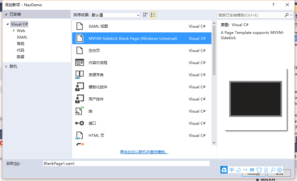
首先通過MVVM-Sidekick提供的專案模板來新建一個UWP專案,命名為NavDemo。
考慮我們要實現的目的:在主頁面放置一個漢堡選單,在右側的content中實現不同頁面的導航。
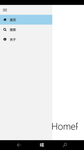
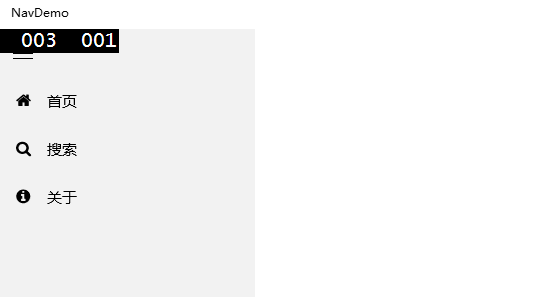
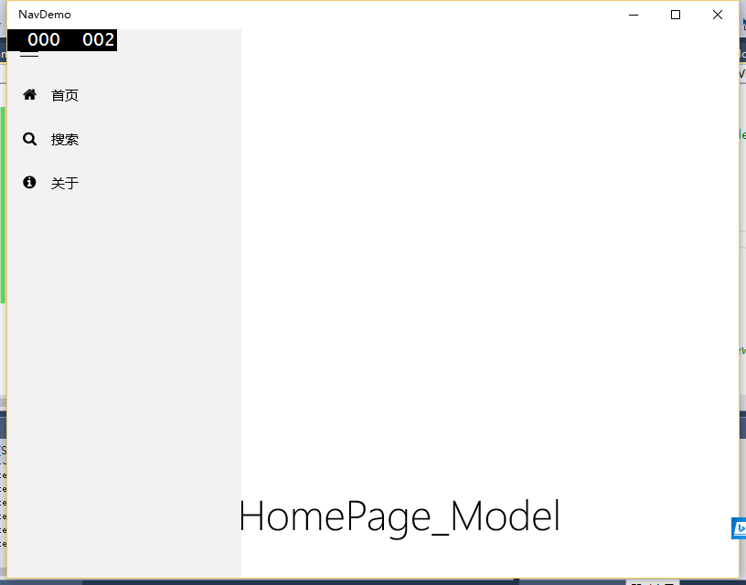
先來看一下效果:
PC版:

手機版:
一、建立選單項類
漢堡選單每個選項一般是由一個圖示和一個文字組成,我還是使用FontAwesomeFont這個字型來顯示圖示,如何使用這個字型來做圖示,可參考我之前的blog。首先建立一個選單的類NavMenuItem,放在Models目錄下,使用provm程式碼段生成兩個屬性:
|
public class NavMenuItem : BindableBase<NavMenuItem> { /// <summary> /// FontAwesomeFontFamily /// </summary> public string Glyph { get { return _GlyphLocator(this).Value; } set { _GlyphLocator(this).SetValueAndTryNotify(value); } } #region Property string Glyph Setup protected Property<string> _Glyph = new Property<string> { LocatorFunc = _GlyphLocator }; static Func<BindableBase, ValueContainer<string>> _GlyphLocator = RegisterContainerLocator<string>("Glyph", model => model.Initialize("Glyph", ref model._Glyph, ref _GlyphLocator, _GlyphDefaultValueFactory)); static Func<string> _GlyphDefaultValueFactory = () => { return default(string); }; #endregion
/// <summary> ///文字 /// </summary> public string Label { get { return _LabelLocator(this).Value; } set { _LabelLocator(this).SetValueAndTryNotify(value); } } #region Property string Label Setup protected Property<string> _Label = new Property<string> { LocatorFunc = _LabelLocator }; static Func<BindableBase, ValueContainer<string>> _LabelLocator = RegisterContainerLocator<string>("Label", model => model.Initialize("Label", ref model._Label, ref _LabelLocator, _LabelDefaultValueFactory)); static Func<string> _LabelDefaultValueFactory = () => { return default(string); }; #endregion
} |
開啟NavDemo\ViewModels\MainPage_Model.cs,使用propvm程式碼段生成一個列表:
|
public ObservableCollection<NavMenuItem> NavMenuItemList { get { return _NavMenuItemListLocator(this).Value; } set { _NavMenuItemListLocator(this).SetValueAndTryNotify(value); } } #region Property ObservableCollection<HamburgerMenuItem> NavMenuItemList Setup protected Property<ObservableCollection<NavMenuItem>> _NavMenuItemList = new Property<ObservableCollection<NavMenuItem>> { LocatorFunc = _NavMenuItemListLocator }; static Func<BindableBase, ValueContainer<ObservableCollection<NavMenuItem>>> _NavMenuItemListLocator = RegisterContainerLocator<ObservableCollection<NavMenuItem>>("NavMenuItemList", model => model.Initialize("NavMenuItemList", ref model._NavMenuItemList, ref _NavMenuItemListLocator, _NavMenuItemListDefaultValueFactory)); static Func<ObservableCollection<NavMenuItem>> _NavMenuItemListDefaultValueFactory = () => default(ObservableCollection<NavMenuItem>); #endregion |
在vm的建構函式裡,新增幾個項:
|
public MainPage_Model() { if (IsInDesignMode ) { Title = "Title is a little different in Design mode"; } NavMenuItemList = new ObservableCollection<NavMenuItem>(); NavMenuItemList.Add(new NavMenuItem { Glyph = "\uf015", Label = "首頁" }); NavMenuItemList.Add(new NavMenuItem { Glyph = "\uf002", Label = "搜尋" }); NavMenuItemList.Add(new NavMenuItem { Glyph = "\uf05a", Label = "關於" }); } |
注意Glyph的賦值方式。
二、顯示漢堡選單
在專案中新建Resources目錄,把FontAwesome.otf字型檔案放在裡面。在專案中新建CustomTheme目錄,然後建立自定義的樣式資原始檔CustomStyles.xaml,程式碼如下:
|
<ResourceDictionary xmlns="http://schemas.microsoft.com/winfx/2006/xaml/presentation" xmlns:x="http://schemas.microsoft.com/winfx/2006/xaml" xmlns:local="using:NavDemo"> <FontFamily x:Key="FontAwesomeFontFamily">/Resources/FontAwesome.otf#FontAwesome</FontFamily>
<Style x:Key="SplitViewTogglePaneButtonStyle" TargetType="ToggleButton"> <Setter Property="FontSize" Value="20" /> <Setter Property="FontFamily" Value="{ThemeResource SymbolThemeFontFamily}" /> <Setter Property="MinHeight" Value="48" /> <Setter Property="MinWidth" Value="48" /> <Setter Property="Margin" Value="0" /> <Setter Property="Padding" Value="0" /> <Setter Property="HorizontalAlignment" Value="Left" /> <Setter Property="VerticalAlignment" Value="Top" /> <Setter Property="HorizontalContentAlignment" Value="Center" /> <Setter Property="VerticalContentAlignment" Value="Center" /> <Setter Property="Background" Value="Transparent" /> <Setter Property="Foreground" Value="{ThemeResource SystemControlForegroundBaseHighBrush}" /> <Setter Property="Content" Value="" /> <Setter Property="AutomationProperties.Name" Value="Menu" /> <Setter Property="UseSystemFocusVisuals" Value="True"/> <Setter Property="Template"> <Setter.Value> <ControlTemplate TargetType="ToggleButton"> <Grid Background="{TemplateBinding Background}" x:Name="LayoutRoot"> <VisualStateManager.VisualStateGroups> <VisualStateGroup x:Name="CommonStates"> <VisualState x:Name="Normal" /> <VisualState x:Name="PointerOver"> <Storyboard> <ObjectAnimationUsingKeyFrames Storyboard.TargetName="LayoutRoot" Storyboard.TargetProperty="(Grid.Background)"> <DiscreteObjectKeyFrame KeyTime="0" Value="{ThemeResource SystemControlHighlightListLowBrush}"/> </ObjectAnimationUsingKeyFrames> <ObjectAnimationUsingKeyFrames Storyboard.TargetName="ContentPresenter" Storyboard.TargetProperty="Foreground"> <DiscreteObjectKeyFrame KeyTime="0" Value="{ThemeResource SystemControlHighlightAltBaseHighBrush}"/> </ObjectAnimationUsingKeyFrames> </Storyboard> </VisualState> <VisualState x:Name="Pressed"> <Storyboard> <ObjectAnimationUsingKeyFrames Storyboard.TargetName="LayoutRoot" Storyboard.TargetProperty="(Grid.Background)"> <DiscreteObjectKeyFrame KeyTime="0" Value="{ThemeResource SystemControlHighlightListMediumBrush}"/> </ObjectAnimationUsingKeyFrames> <ObjectAnimationUsingKeyFrames Storyboard.TargetName="ContentPresenter" Storyboard.TargetProperty="Foreground"> <DiscreteObjectKeyFrame KeyTime="0" Value="{ThemeResource SystemControlHighlightAltBaseHighBrush}"/> </ObjectAnimationUsingKeyFrames> </Storyboard> </VisualState> <VisualState x:Name="Disabled"> <Storyboard> <ObjectAnimationUsingKeyFrames Storyboard.TargetName="ContentPresenter" Storyboard.TargetProperty="(TextBlock.Foreground)"> <DiscreteObjectKeyFrame KeyTime="0" Value="{ThemeResource SystemControlDisabledBaseLowBrush}"/> </ObjectAnimationUsingKeyFrames> </Storyboard> </VisualState> <VisualState x:Name="Checked"/> <VisualState x:Name="CheckedPointerOver"> <Storyboard> <ObjectAnimationUsingKeyFrames Storyboard.TargetName="LayoutRoot" Storyboard.TargetProperty="(Grid.Background)"> <DiscreteObjectKeyFrame KeyTime="0" Value="{ThemeResource SystemControlHighlightListLowBrush}"/> </ObjectAnimationUsingKeyFrames> <ObjectAnimationUsingKeyFrames Storyboard.TargetName="ContentPresenter" Storyboard.TargetProperty="Foreground"> <DiscreteObjectKeyFrame KeyTime="0" Value="{ThemeResource SystemControlHighlightAltBaseHighBrush}"/> </ObjectAnimationUsingKeyFrames> </Storyboard> </VisualState> <VisualState x:Name="CheckedPressed"> <Storyboard> <ObjectAnimationUsingKeyFrames Storyboard.TargetName="LayoutRoot" Storyboard.TargetProperty="(Grid.Background)"> <DiscreteObjectKeyFrame KeyTime="0" Value="{ThemeResource SystemControlHighlightListMediumBrush}"/> </ObjectAnimationUsingKeyFrames> <ObjectAnimationUsingKeyFrames Storyboard.TargetName="ContentPresenter" Storyboard.TargetProperty="Foreground"> <DiscreteObjectKeyFrame KeyTime="0" Value="{ThemeResource SystemControlHighlightAltBaseHighBrush}"/> </ObjectAnimationUsingKeyFrames> </Storyboard> </VisualState> <VisualState x:Name="CheckedDisabled"> <Storyboard> <ObjectAnimationUsingKeyFrames Storyboard.TargetName="ContentPresenter" Storyboard.TargetProperty="(TextBlock.Foreground)"> <DiscreteObjectKeyFrame KeyTime="0" Value="{ThemeResource SystemControlDisabledBaseLowBrush}"/> </ObjectAnimationUsingKeyFrames> </Storyboard> </VisualState> </VisualStateGroup> </VisualStateManager.VisualStateGroups> <ContentPresenter x:Name="ContentPresenter" Content="{TemplateBinding Content}" Margin="{TemplateBinding Padding}" HorizontalAlignment="{TemplateBinding HorizontalContentAlignment}" VerticalAlignment="{TemplateBinding VerticalContentAlignment}" AutomationProperties.AccessibilityView="Raw" /> </Grid> </ControlTemplate> </Setter.Value> </Setter> </Style> </ResourceDictionary> |
然後開啟App.xaml檔案,把這個資源引用進來:
|
<Application.Resources> <ResourceDictionary> <ResourceDictionary.MergedDictionaries> <ResourceDictionary Source="CustomTheme/CustomStyles.xaml"/> </ResourceDictionary.MergedDictionaries> </ResourceDictionary> </Application.Resources> |
樣式資原始檔裡主要定義了兩個樣式,一是定義了FontAwesomeFontFamily字型,二是定義了一個針對ToggleButton的按鈕樣式SplitViewTogglePaneButtonStyle,作為漢堡選單的開關。這個開關鍵為什麼要設定高度為48呢?參考https://msdn.microsoft.com/zh-cn/library/windows/apps/dn997787.aspx
|
拆分檢視控制元件具有一個可展開/可摺疊的窗格和一個內容區域。內容區域始終可見。窗格可以展開和摺疊或停留在開啟狀態,而且可以從應用視窗的左側或右側顯示其自身。窗格中有三種模式:
|
所以我就根據官方文件設定為48了。
修改MainPage.xaml,把根Grid改為以下程式碼:
|
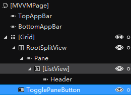
<Grid Background="{ThemeResource ApplicationPageBackgroundThemeBrush}" DataContext="{StaticResource DesignVM}"> <!-- Top-level navigation menu + app content --> <SplitView x:Name="RootSplitView" IsPaneOpen="True" DisplayMode="Inline" OpenPaneLength="256" IsTabStop="False"> <SplitView.Pane> <!-- A custom ListView to display the items in the pane. The automation Name is set in the ContainerContentChanging event. -->
<ListView ItemsSource="{Binding NavMenuItemList}"> </ListView> </SplitView.Pane>
<SplitView.Content> <Frame x:Name="mainFrame"> </Frame> </SplitView.Content> </SplitView>
<!-- Declared last to have it rendered above everything else, but it needs to be the first item in the tab sequence. --> <ToggleButton x:Name="TogglePaneButton" TabIndex="1" Style="{StaticResource SplitViewTogglePaneButtonStyle}" IsChecked="{Binding IsPaneOpen, ElementName=RootSplitView, Mode=TwoWay}"
AutomationProperties.Name="Menu" ToolTipService.ToolTip="Menu" /> </Grid> |
為了方便檢視選單展開的效果,暫時先把IsPaneOpen屬性設定為true,OpenPaneLength設定的是選單展開後的寬度。在Pane裡放一個ListView,ItemSource繫結到之前做好的NavMenuItemList上。SplitView的Content設定為一個Frame,用來展示右側的頁面。
注意,如果當SplitView的Content直接設定為Frame的時候,也就是把外層的<SplitView.Content>去掉後,會報一個錯:
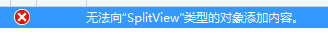
這個錯誤可以不用理會,程式是可以正常執行的。
此外 還要有一個按鈕來控制選單的展開關閉狀態,用一個ToggleButton來實現,這個按鈕的圖示一般是三個橫槓,設定其Style為SplitViewTogglePaneButtonStyle即可。
然後,還要設定ListView的項模板,可以使用Blend來設計項模板,但因為這個比較簡單,我就直接手寫了,在Resources目錄下新增一個資原始檔CustomDataTemplates.xaml,專案所有的自定義模板都可以寫在這裡,程式碼如下:
|
<ResourceDictionary xmlns="http://schemas.microsoft.com/winfx/2006/xaml/presentation" xmlns:x="http://schemas.microsoft.com/winfx/2006/xaml" xmlns:Interactivity="using:Microsoft.Xaml.Interactivity" xmlns:Core="using:Microsoft.Xaml.Interactions.Core" xmlns:Behaviors="using:MVVMSidekick.Behaviors">
<DataTemplate x:Key="NavMenuItemTemplate" > <Grid> <Grid.ColumnDefinitions> <ColumnDefinition MinWidth="48" /> <ColumnDefinition /> </Grid.ColumnDefinitions> <FontIcon x:Name="Glyph" FontFamily="{StaticResource FontAwesomeFontFamily}" FontSize="16" Margin="0" Glyph="{Binding Glyph}" VerticalAlignment="Center" HorizontalAlignment="Center" ToolTipService.ToolTip="{Binding Label}"/> <TextBlock x:Name="Text" Grid.Column="1" Text="{Binding Label}" VerticalAlignment="Center"/> </Grid> </DataTemplate> </ResourceDictionary> |
在這裡定義一個項模板NavMenuItemTemplate,在裡面放一個FontIcon,把Glyph屬性繫結到NavMenuItem的Glyph屬性,當然不要忘了把FontFamily設定為我們在自定義樣式裡定義好的FontAwesomeFontFamily,不然是不會生效的。
再把這個項模板應用到頁面的ListView控制元件上:
|
ItemTemplate="{StaticResource NavMenuItemTemplate}" |
現在跑一下試試,報錯了:
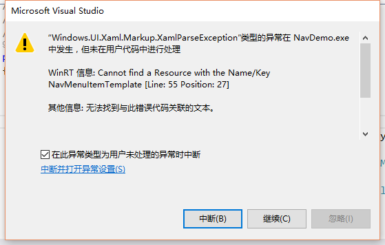
原來忘了把剛才的模板檔案引入進來,修改App.xaml,修改為以下的樣子:
|
<Application.Resources> <ResourceDictionary> <ResourceDictionary.MergedDictionaries> <ResourceDictionary Source="CustomTheme/CustomStyles.xaml"/> <ResourceDictionary Source="Resources/CustomDataTemplates.xaml" /> </ResourceDictionary.MergedDictionaries> </ResourceDictionary> </Application.Resources> |
現在可以執行了:

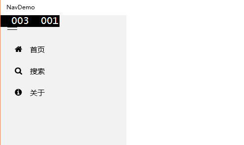
貌似左上角的按鈕跟ListView重疊了,這樣可不好看。
三、調整顯示效果
左上角的按鈕應用了SplitViewTogglePaneButtonStyle樣式,最小高度為48,把ListView往下移動一點,新增一個Margin屬性,頂部把開關按鈕的空間空出來:
|
<ListView Margin="0,48,0,0" ItemsSource="{Binding NavMenuItemList}" ItemTemplate="{StaticResource NavMenuItemTemplate}"> |
現在列表位置正常了,但圖示的位置貌似還是偏右了,那就再給ListView設定ItemContainerStyle樣式,在CustomStyles.xaml檔案裡新增以下程式碼:
|
<Style x:Key="NavMenuItemContainerStyle" TargetType="ListViewItem"> <Setter Property="MinWidth" Value="{StaticResource SplitViewCompactPaneThemeLength}"/> <Setter Property="Height" Value="48"/> <Setter Property="Padding" Value="0"/> </Style> |
ListView應用此樣式:
|
<ListView Margin="0,48,0,0" ItemsSource="{Binding NavMenuItemList}" ItemTemplate="{StaticResource NavMenuItemTemplate}" ItemContainerStyle="{StaticResource NavMenuItemContainerStyle}"> </ListView> |
再跑一下:
現在樣式正常了。
四、增加新頁面
現在MainPage.xaml只是一個殼,右側內容是空的,下面來新增幾個頁面。在專案裡新增幾個頁面,比如可以命名為HomePage、SearchPage、AboutPage等:
因為每個頁面裡已經預設新增了一個TextBlock,並且繫結到了vm的Title屬性,這個屬性預設取值就是當前頁面的Name,所以我們就不用改了,知道當前頁面是哪個就行了。
現在的問題是,如何在MainPage載入時,自動在SplitView的Content裡顯示HomePage呢?
這就需要用到MVVM-Sidekick的一個Behavior了,用Blend開啟專案,找到行為:
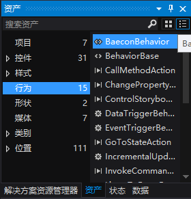
有一個叫做BaeconBehavior的行為,把它拖到……咦,怎麼找不到Content呢?
那就直接手寫吧,把Frame部分的程式碼改成這樣:
|
<SplitView.Content> <Frame x:Name="mainFrame" mvvm:StageManager.Beacon="frameMain" x:FieldModifier="public">
</Frame> </SplitView.Content> |
StageManager.Beacon屬性是用來標識StageManager,MVVM-Sidekick已經把導航的功能封裝到了StageManager裡,以前我們一般使用this.StageManager.DefaultStage.Show(xxx)的方式來使用,即可實現整個頁面的導航,如果要實現頁面內某個區域的導航,就需要手動指定是哪個StageManager了,這就需要使用以下屬性來標識某個區域:
|
mvvm:StageManager.Beacon="frameMain" |
找到OnBindedViewLoad方法,取消預設的註釋,將該方法改為以下的樣子:
|
protected override async Task OnBindedViewLoad(MVVMSidekick.Views.IView view) { await base.OnBindedViewLoad(view); await StageManager["frameMain"].Show(new HomePage_Model()); } |
這裡要注意,一定要等Bind完成後再Show,不然會顯示不出來哦,因為要將整個頁面Bind完後,才可以進行後續的動作。
跑一下看看:
很好,預設轉到HomePage頁了。
五、實現其他頁面導航
現在可以處理選單部分的導航了,點選不同的項導航到不同的頁面。看到這裡應該也有個大概了,處理不同項的點選事件,將名為frameMain的StageManager使用Show方法展示不同的ViewModel即可。
使用ItemClick事件嗎?No,還記得我之前提過的SendToEventRouterAction嗎?如果不熟悉的話就翻翻我之前的blog吧,這裡我還是用這個Action來實現。
修改項模板為:
|
<DataTemplate x:Key="NavMenuItemTemplate" > <Grid> <Interactivity:Interaction.Behaviors> <Core:EventTriggerBehavior EventName="Tapped"> <Behaviors:SendToEventRouterAction IsEventFiringToAllBaseClassesChannels="True" EventRoutingName="NavToPage" EventData="{Binding}" /> </Core:EventTriggerBehavior> </Interactivity:Interaction.Behaviors> <Grid.ColumnDefinitions> <ColumnDefinition MinWidth="48" /> <ColumnDefinition /> </Grid.ColumnDefinitions> <FontIcon x:Name="Glyph" FontFamily="{StaticResource FontAwesomeFontFamily}" FontSize="16" Margin="0" Glyph="{Binding Glyph}" VerticalAlignment="Center" HorizontalAlignment="Center" ToolTipService.ToolTip="{Binding Label}"/> <TextBlock x:Name="Text" Grid.Column="1" Text="{Binding Label}" VerticalAlignment="Center"/> </Grid> </DataTemplate> |
然後在MainPage_Model.cs檔案中,新增一個方法:
|
private void RegisterCommand() { //一般列表項點選事件 MVVMSidekick.EventRouting.EventRouter.Instance.GetEventChannel<Object>() .Where(x => x.EventName == "NavToPage") .Subscribe( async e => { NavMenuItem item = e.EventData as NavMenuItem; if (item != null) { switch (item.Label) { case "首頁": await StageManager["frameMain"].Show(new HomePage_Model()); break; case "搜尋": await StageManager["frameMain"].Show(new SearchPage_Model()); break;
case "關於": await StageManager["frameMain"].Show(new AboutPage_Model()); break; default: break; } } } ).DisposeWith(this);
} |
別忘了在OnBindedViewLoad方法裡呼叫一下:
|
private bool isLoaded; /// <summary> /// This will be invoked by view when the view fires Load event and this viewmodel instance is already in view's ViewModel property /// </summary> /// <param name="view">View that firing Load event</param> /// <returns>Task awaiter</returns> protected override async Task OnBindedViewLoad(MVVMSidekick.Views.IView view) { if (!isLoaded) { this.RegisterCommand(); this.isLoaded = true; } await base.OnBindedViewLoad(view); await StageManager["frameMain"].Show(new HomePage_Model()); } |
新增一個isLoaded屬性是避免重複呼叫。
跑一下看看,咦,有時候好用,有時候不好用,點選圖示和文字的時候好用,點選不到圖示和文字就不好用,這是什麼原因?
熟悉ListView的同學可能會想到,ListViewItem預設是沒有橫向撐滿的,所以雖然點選了項,但因為項模板裡的Grid沒有橫向撐滿,所以並沒有觸發Grid的Tapped事件,那我們可以設定ListItemStyle,讓ListViewItem都橫向撐滿。在NavMenuItemContainerStyle裡新增以下程式碼:
|
<Setter Property="HorizontalContentAlignment" Value="Stretch"/> <Setter Property="VerticalContentAlignment" Value="Stretch"/> |
這樣就可以橫向縱向撐滿了,再跑下:
又亂套了,再改哪裡呢,修改項模板NavMenuItemTemplate,設定左側列寬為Auto:
|
<DataTemplate x:Key="NavMenuItemTemplate" > <Grid > <Interactivity:Interaction.Behaviors> <Core:EventTriggerBehavior EventName="Tapped"> <Behaviors:SendToEventRouterAction IsEventFiringToAllBaseClassesChannels="True" EventRoutingName="NavToPage" EventData="{Binding}" /> </Core:EventTriggerBehavior> </Interactivity:Interaction.Behaviors> <Grid.ColumnDefinitions> <ColumnDefinition MinWidth="48" Width="Auto" /> <ColumnDefinition /> </Grid.ColumnDefinitions> <FontIcon x:Name="Glyph" FontFamily="{StaticResource FontAwesomeFontFamily}" FontSize="16" Margin="0" Glyph="{Binding Glyph}" VerticalAlignment="Center" HorizontalAlignment="Center" ToolTipService.ToolTip="{Binding Label}"/> <TextBlock x:Name="Text" Grid.Column="1" Text="{Binding Label}" VerticalAlignment="Center" /> </Grid> </DataTemplate> |
再執行一下:
現在正常了。
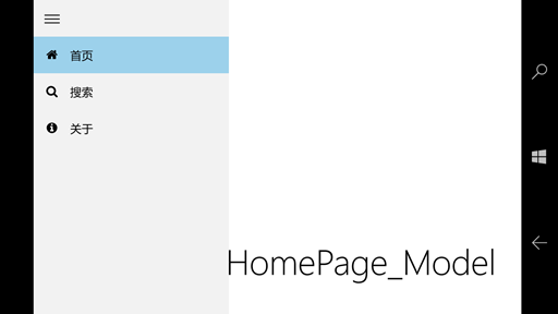
看一下手機上的樣子:
六、其他細節調整
使用了一下感覺還是有點細節需要改進,比如選單彈出後,點選項後應該讓選單自動縮回去,現在改一下吧。
在MainPage的vm裡新增一個屬性:
|
/// <summary> ///是否展開選單 /// </summary> public bool IsPaneOpen { get { return _IsPaneOpenLocator(this).Value; } set { _IsPaneOpenLocator(this).SetValueAndTryNotify(value); } } #region Property bool IsPaneOpen Setup protected Property<bool> _IsPaneOpen = new Property<bool> { LocatorFunc = _IsPaneOpenLocator }; static Func<BindableBase, ValueContainer<bool>> _IsPaneOpenLocator = RegisterContainerLocator<bool>("IsPaneOpen", model => model.Initialize("IsPaneOpen", ref model._IsPaneOpen, ref _IsPaneOpenLocator, _IsPaneOpenDefaultValueFactory)); static Func<bool> _IsPaneOpenDefaultValueFactory = () => default(bool); #endregion |
在vm的建構函式裡將此值設定為false,預設為關閉。
然後將SplitView的IsPaneOpen屬性繫結到上面:
|
<SplitView x:Name="RootSplitView" IsPaneOpen="{Binding IsPaneOpen,Mode=TwoWay}" DisplayMode="Inline" OpenPaneLength="256" IsTabStop="False"> |
修改RegisterCommand方法,在點選每個項的部分,新增以下程式碼,關閉選單:
|
this.IsPaneOpen = false; |
現在點選選單項後可以自動關閉選單皮膚了。
還可以繼續針對PC版和手機版調整一下細節,PC版螢幕大,可以讓選單收起時留下圖示的部分,這就需要調整PC版的DisplayMode屬性為CompactInline,需要請StateTriggers出馬了。
在根Grid裡新增以下程式碼:
|
<!-- Adaptive triggers --> <VisualStateManager.VisualStateGroups> <VisualStateGroup> <VisualState> <VisualState.StateTriggers> <AdaptiveTrigger MinWindowWidth="720" /> </VisualState.StateTriggers> <VisualState.Setters> <Setter Target="RootSplitView.DisplayMode" Value="CompactInline"/> <Setter Target="RootSplitView.IsPaneOpen" Value="True"/> <Setter Target="RootSplitView.CompactPaneLength" Value="48" /> </VisualState.Setters> </VisualState> <VisualState> <VisualState.StateTriggers> <AdaptiveTrigger MinWindowWidth="0" /> </VisualState.StateTriggers> <VisualState.Setters> <Setter Target="RootSplitView.DisplayMode" Value="Overlay"/> </VisualState.Setters> </VisualState> </VisualStateGroup> </VisualStateManager.VisualStateGroups> |
這段程式碼的意思是,如果寬度大於720,就將SplitView的DisplayMode設定為CompactInline,選單收起的時候可以保留圖示部分,這部分圖示的寬度通過CompactPaneLength這個值來設定。
還有一點,手機是有硬體返回鍵的,在選單彈出的時候,如果使用者點選了返回鍵,應該讓選單縮回去,所以還要額外處理一下手機的返回鍵。
給專案新增Mobile Extensions引用:

注意我安裝了兩個版本的SDK,這裡需要根據專案的實際版本來選擇對應的擴充套件。
開啟MainPage.xaml.cs,新增以下程式碼:
|
protected override void OnNavigatedTo(NavigationEventArgs e) { if (Windows.Foundation.Metadata.ApiInformation.IsTypePresent("Windows.Phone.UI.Input.HardwareButtons")) { HardwareButtons.BackPressed += HardwareButtons_BackPressed; } base.OnNavigatedTo(e); }
protected override void OnNavigatedFrom(NavigationEventArgs e) { if (Windows.Foundation.Metadata.ApiInformation.IsTypePresent("Windows.Phone.UI.Input.HardwareButtons")) { HardwareButtons.BackPressed -= HardwareButtons_BackPressed; } base.OnNavigatedFrom(e); }
private void HardwareButtons_BackPressed(object sender, BackPressedEventArgs e) { //throw new NotImplementedException(); var vm = this.LayoutRoot.DataContext as MainPage_Model; if (vm != null) { if (vm.IsPaneOpen) { e.Handled = true; vm.IsPaneOpen = false; } } } |
至此,一個具有基本功能的漢堡選單就完成了,可以通過修改背景色、前景色等方式再來改善展示效果。再來總結一下主要的知識點:
- 使用SplitView來區分選單皮膚和內容部分;
- 使用FontAwesomeFont字型顯示圖示;
- 為區域使用mvvm:StageManager.Beacon屬性來設定StageManager的標識,並通過StageManager["xxx"]的形式來呼叫;
- 通過StateTriggers來為PC和手機端設定不同的選單效果;
- 通過新增Mobile Extensions引用來支援手機硬體返回鍵;
附demo下載地址:
連結:http://pan.baidu.com/s/1pJRJcRh 密碼:jofi