React Native flexBox佈局(一)
序:
佈局想必大家都知道,在iOS 中我們使用程式碼計算螢幕寬高佈局,使用Autoresizing和AutoLayout進行佈局。在web中的佈局一般都是依靠CSS的盒子模型,09年W3C提出了一種新的佈局方案,Flex佈局。ReactNative就是選用了這種佈局方式。下面我們來看下FlexBox佈局吧。
1、FlexBox是什麼
Flex 是Flexible Box的縮寫,字面上的意思就是彈性盒子。意為“彈性佈局”,用來為盒狀模型提供最大的靈活性。
- flexible(形容詞):能夠伸縮或者很容易變化,以適應外界條件的變化
- box(名詞):通用的矩形容器
跟iOS AutoLayout比,我認為FlexBox的主要特點就是容器的子集可以根據容器的大小按比分配,還有豐富的對齊方式。
2、FlexBox基本概念
採用 Flex 佈局的元素,稱為 Flex 容器(flex container),簡稱"容器"。它的所有子元素自動成為容器成員,稱為 Flex 專案(flex item),簡稱"專案"。
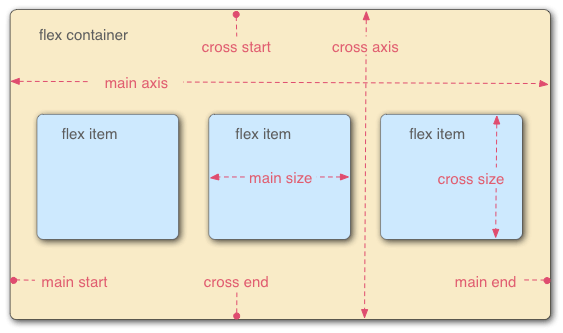
容器預設存在兩根軸:水平的主軸(main axis)和垂直的交叉軸(cross axis)。主軸的開始位置(與邊框的交叉點)叫做main start,結束位置叫做main
end;交叉軸的開始位置叫做cross start,結束位置叫做cross
end。
專案預設沿主軸排列。單個專案佔據的主軸空間叫做main size,佔據的交叉軸空間叫做cross
size。
3、容器的屬性
-
flexDirection
- flexWrap
- justifyContent
- alignItems
3.1 flexDirection屬性
flexDirection屬性決定主軸的方向(即專案的排列方向)。
主要四個屬性值:
- row 主軸方向為橫向,從左到
- row-reverse 橫向,反方向
- column 豎向,自上向下
- column-reverse 豎向,自下向上
import React, { Component } from 'react';
import {
   AppRegistry,
  Image,
  ListView,
  StyleSheet,
  Text,
  View,
} from 'react-native';


class RNHybrid extends Component {

  render() {
    return(
        <View> //切換flexDirection屬性看結果
        <View style={{backgroundColor:'red',width:100,height:40,marginTop:100}}>
        </View>
        <View style={{backgroundColor:'yellow',width:100,height:40,marginTop:100}}>
        </View>
        <View style={{backgroundColor:'blue',width:100,height:40,marginTop:100}}>
        </View>
        </View>
      );
  }
}

AppRegistry.registerComponent('RNHybrid', () => RNHybrid);
1.預設是column效果如下:

2. column 最外層View的屬性加上style={{flexDirection:'column-reverse'}} 翻轉了效果如下:

下面屬性的就不貼了,自己試試就知道了。
3.2 flexWrap屬性
如果我們的主軸為橫向正向,那麼我們的子控制元件排不開了怎麼辦?會自動換行嗎?
程式碼是把上面的View寬度都變成三個加一塊能超過螢幕的寬度,我的模擬器是6s,我讓三個子View寬度為150。
觀察demo看下答案:

預設flexWrap屬性是不換行,下面來學習下這個屬性。
flexWrap: nowrap
| wrap | wrap-reverse
wrap換行效果:

3.3 justifyContent屬性
justifyContent屬性定義了專案在主軸上的對齊方式。(自己試驗是在橫軸上)
justifyContent: flex-start | flex-end | center | space-between | space-around;
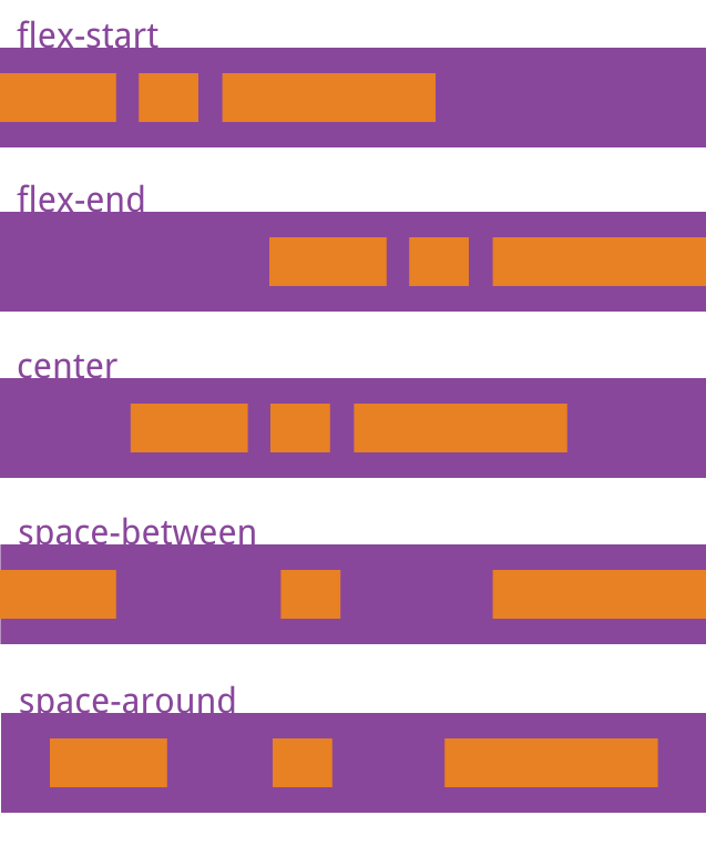
它可能取5個值,具體對齊方式與軸的方向有關。下面假設主軸為從左到右。
flex-start(預設值):左對齊flex-end:右對齊center: 居中space-between:兩端對齊,專案之間的間隔都相等。space-around:每個專案兩側的間隔相等。所以,專案之間的間隔比專案與邊框的間隔大一倍。
3.4 alignItems屬性
alignItems屬性定義專案在交叉軸上如何對齊。
alignItems: flex-start | flex-end | center | baseline | stretch;
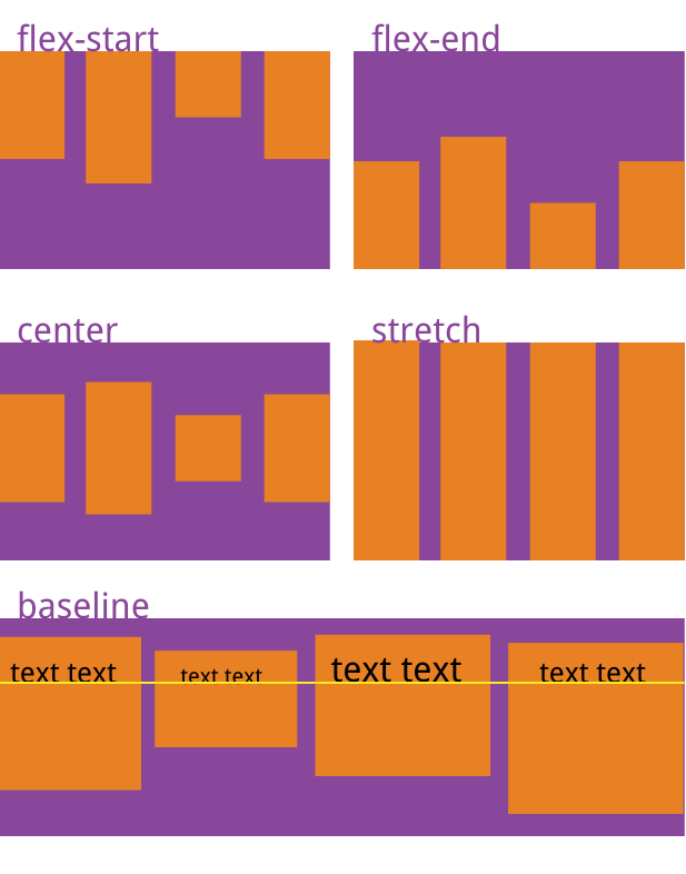
它可能取5個值。具體的對齊方式與交叉軸的方向有關,下面假設交叉軸從上到下。
flex-start:交叉軸的起點對齊。flex-end:交叉軸的終點對齊。center:交叉軸的中點對齊。baseline: 專案的第一行文字的基線對齊。stretch(預設值):如果專案未設定高度或設為auto,將佔滿整個容器的高度。
4、元素的屬性
- alignSelf
- flexGrow
- flexShrink
- flexBasis
- flex
4.1 alignSelf屬性
alignSelf屬性允許單個專案有與其他專案不一樣的對齊方式,可覆蓋alignItems屬性。預設值為auto,表示繼承父元素的alignItems屬性,如果沒有父元素,則等同於stretch。alignSelf: auto | flex-start | flex-end | center | baseline | stretch;
import React, { Component } from 'react';
import {
   AppRegistry,
  Image,
  ListView,
  StyleSheet,
  Text,
  View,
} from 'react-native';


class RNHybrid extends Component {

  render() {
    return(
        <View style={{flexDirection:'row',justifyContent:'space-around',alignItems:'flex-start'}}>
        <View style={{backgroundColor:'red',width:30,height:30,marginTop:100,alignSelf:'flex-end'}}>
        </View>
        <View style={{backgroundColor:'yellow',width:30,height:40,marginTop:100}}>
        </View>
        <View style={{backgroundColor:'blue',width:30,height:50,marginTop:100}}>
        </View>
        </View>
      );
  }
}

AppRegistry.registerComponent('RNHybrid', () => RNHybrid);
效果:

4.2 flexGrow屬性
flex-grow屬性定義專案的放大比例,預設為0,即如果存在剩餘空間,也不放大。
程式碼:
render() {
    return(
        <View style={{flexDirection:'row',justifyContent:'space-around',alignItems:'flex-start'}}>
        <View style={{backgroundColor:'red',width:30,height:30,marginTop:100,flexGrow:1}}>
        </View>
        <View style={{backgroundColor:'yellow',width:30,height:40,marginTop:100,flexGrow:2}}>
        </View>
        <View style={{backgroundColor:'blue',width:30,height:50,marginTop:100,flexGrow:1}}>
        </View>
        </View>
      );
  }
總結:我們可以看出,這個屬性不受原來寬度的限制,從新按比例分配。
注意:如果第一個紅色View控制元件該屬性為0或者沒有該屬性,其他兩個View擁有該屬性,那麼這個View會把這行紅色View所佔空間剩下的空間按比例分配。如Demo2
Demo2:
程式碼:
return(
        <View style={{flexDirection:'row',justifyContent:'space-around',alignItems:'flex-start'}}>
        <View style={{backgroundColor:'red',width:250,height:30,marginTop:100}}>
        </View>
        <View style={{backgroundColor:'yellow',width:30,height:40,marginTop:100,flexGrow:2}}>
        </View>
        <View style={{backgroundColor:'blue',width:30,height:50,marginTop:100,flexGrow:1}}>
        </View>
        </View>
      );
效果:

4.3 flexShrink屬性
flexShrink屬性定義了專案的縮小比例,預設為1,即如果空間不足,該專案將縮小。return(
<View style={{flexDirection:'row',justifyContent:'space-around',alignItems:'flex-start'}}>
<View style={{backgroundColor:'red',width:100,height:30,marginTop:100,flexShrink:0}}>
</View>
<View style={{backgroundColor:'yellow',width:200,height:40,marginTop:100,flexShrink:1}}>
</View>
<View style={{backgroundColor:'blue',width:200,height:50,marginTop:100,flexShrink:0}}>
</View>
</View>
);
4.4 flexBasis屬性
flexBasis屬性定義了在分配多餘空間之前,專案佔據的主軸空間(main size)。瀏覽器根據這個屬性,計算主軸是否有多餘空間。它的預設值為auto,即專案的本來大小。render() {
return(
<View style={{flexDirection:'row',alignItems:'flex-end'}}>
<View style={{backgroundColor:'red',width:200,height:30,marginTop:100,flexShrink:1}}>
</View>
<View style={{backgroundColor:'yellow',width:200,height:40,marginTop:100,flexBasis:350}}>
</View>
<View style={{backgroundColor:'blue',width:200,height:50,marginTop:100,flexShrink:1}}>
</View>
</View>
);
}
4.5 flex屬性
flex屬性,我認為對於彈性佈局是一個很重要的屬性,以後應用較多。
flex屬性是flex-grow, flex-shrink 和 flex-basis的簡寫,預設值為0
1 auto。後兩個屬性可選。render() {
return(
<View style={{flexDirection:'row',alignItems:'flex-end'}}>
<View style={{backgroundColor:'red',width:200,height:30,marginTop:100,flex:1}}>
</View>
<View style={{backgroundColor:'yellow',width:200,height:40,marginTop:100,flex:2}}>
</View>
<View style={{backgroundColor:'blue',width:200,height:50,marginTop:100,flex:3}}>
</View>
</View>
);
}效果:

相關文章
- React Native佈局(flexbox)React NativeFlex
- React Native 之 flexbox佈局React NativeFlex
- React Native 探索(四)Flexbox 佈局詳解React NativeFlex
- React Native FlexBox佈局(二) 應用篇React NativeFlex
- iOS學習React-Native 的flexbox佈局iOSReactFlex
- React Native基礎&入門教程:初步使用Flexbox佈局React NativeFlex
- React Native——flex(彈性佈局)React NativeFlex
- React Native 佈局 (組內分享)React Native
- React Native 頁面佈局簡介React Native
- React-Native flex 佈局使用總結ReactFlex
- Flexbox——快速佈局神器Flex
- react-native筆記(flexbox)React筆記Flex
- React Native預設佔位佈局placeholderReact Native
- react-native佈局和樣式設定React
- React Native元件佈局應用示例小結React Native元件
- iOS Flexbox 佈局優化iOSFlex優化
- iOS 上的 FlexBox 佈局iOSFlex
- CSS3佈局神器 - FlexboxCSSS3Flex
- Android上的Flexbox佈局AndroidFlex
- 快速佈局神器Flexbox資源大全!Flex
- 【譯】React Native佈局原理(以及Fabric將做出的改變)React Native
- React Native 小例項 採用View佈局如下檢視React NativeView
- 響應式佈局:CSS-flexbox & BootstrapCSSFlexboot
- Flexbox 佈局的最簡單表單Flex
- Flexbox 佈局的正確使用姿勢Flex
- 70個react-native flex佈局栗子,肯定有你要的ReactFlex
- 拒絕爛大街——Flexbox佈局演示站了解一下Flex
- flexbox佈局下flex:auto的元素沒有平均分佈Flex
- [譯] 使用 CSS 柵格和 Flexbox 打造 Trello 佈局CSSFlex
- 想象一雙結實而富有彈性的大腿:理解 Flexbox 佈局Flex
- 一對一直播系統原始碼,Flexbox+ReclyclerView實現流式佈局原始碼FlexView
- 如何使用Flexbox和CSS Grid,實現高效佈局FlexCSS
- flexbox(彈性盒佈局模型),以及適用場景Flex模型
- 如何使用 Flexbox 和 CSS Grid,實現高效佈局FlexCSS
- iOS 中使用 FlexBox 佈局實現圖片九宮格iOSFlex
- [譯] 當你建立 Flexbox 佈局時,都發生了什麼?Flex
- 原生 js 實現瀑布流佈局、React 版本的瀑布流佈局元件JSReact元件
- 深度解析 CSS Flexbox 佈局 - 2020年最新版CSSFlex