android shape的使用詳解以及常用效果(漸變色、分割線、邊框、半透明陰影效果等)
shape使用、漸變色、分割線、邊框、半透明、半透明陰影效果。
首先簡單瞭解一下shape中常見的屬性。(詳細介紹參看 api文件)
轉載請註明:Rflyee_大飛:http://blog.csdn.net/rflyee/article/details/20785495
<?xml version="1.0" encoding="utf-8"?>
<shape
    xmlns:android="http://schemas.android.com/apk/res/android"
    android:shape=["rectangle" | "oval" | "line" | "ring"] >   --- 預設為rectangle
    <corners  -- shape=“rectangle”時使用,
        android:radius="integer"  -- 半徑,會被下邊的屬性覆蓋,預設為1dp,
        android:topLeftRadius="integer"
        android:topRightRadius="integer"
        android:bottomLeftRadius="integer"
        android:bottomRightRadius="integer" />
    <gradient  -- 漸變
        android:angle="integer"
        android:centerX="integer"
        android:centerY="integer"
        android:centerColor="integer"
        android:endColor="color"
        android:gradientRadius="integer"
        android:startColor="color"
        android:type=["linear" | "radial" | "sweep"]
        android:useLevel=["true" | "false"] />
    <padding
        android:left="integer"
        android:top="integer"
        android:right="integer"
        android:bottom="integer" />
    <size    -- 指定大小,一般用在imageview配合scaleType屬性使用。大小一般會適配滴
        android:width="integer"
        android:height="integer" />
    <solid    -- 填充顏色,可是是十六進位制顏色。(比如想設定半透明效果,直接使用十六就只就OK)
        android:color="color" />
    <stroke    -- 指定邊框,border,dashWidth和dashGap有一個為0dp則為實線
        android:width="integer"
        android:color="color"
        android:dashWidth="integer"    -- 虛線寬度
        android:dashGap="integer" />    -- 虛線間隔寬度
</shape>
注意:
<corners>
1、android:radius,半徑,會被下邊的單個角度半徑屬性覆蓋,預設為1dp,
2、在使用時,如果單獨設定四個角度,又大小不一致時,eclipse的graphics preview會報錯。但是直接真機執行即可。(比如實線上邊直角,下邊屈角的效果)
<size>
Note: The
shape scales to the size of the container View proportionate to the dimensions defined here, by default. When you use the shape in an
ImageView,
you can restrict scaling by setting the android:scaleType to "center"
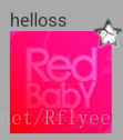
舉個栗子:
res/drawable/gradient_box.xml:<?xml version="1.0" encoding="utf-8"?>
<shape xmlns:android="http://schemas.android.com/apk/res/android"
android:shape="rectangle">
<gradient
android:startColor="#FFFF0000"
android:endColor="#80FF00FF"
android:angle="45"/>
<padding android:left="7dp"
android:top="7dp"
android:right="7dp"
android:bottom="7dp" />
<corners android:radius="8dp" />
</shape>
如圖:
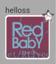
2、白色邊框、半透明效果
<?xml version="1.0" encoding="utf-8"?>
<shape xmlns:android="http://schemas.android.com/apk/res/android"
    android:shape="rectangle" >
    <corners android:radius="16dp" />
    <!-- 這是半透明,還可以設定全透明,那就是白色邊框的效果了 -->
    <solid android:color="#80065e8d" />
    <stroke
        android:dashGap="0dp"
        android:width="4dp"
        android:color="@android:color/white" />
</shape>
如圖:

3、分割線效果:
<?xml version="1.0" encoding="utf-8"?>
<shape xmlns:android="http://schemas.android.com/apk/res/android"
    android:shape="line" >
    <stroke
        android:width="4dp"
        android:color="@android:color/black" />
</shape>
如果:

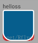
4、單邊屈角效果
<?xml version="1.0" encoding="utf-8"?>
<shape android:shape="rectangle" xmlns:android="http://schemas.android.com/apk/res/android">

    <corners
        android:topLeftRadius="5dp"
        android:topRightRadius="5dp"
        android:bottomLeftRadius="30dp"
        android:bottomRightRadius="30dp"/>

    <!-- 這是半透明,還可以設定全透明,那就是白色邊框的效果了 -->
    <solid android:color="#ff065e8d" />

    <stroke
        android:dashGap="0dp"
        android:width="4dp"
        android:color="@android:color/white" />

</shape>
如圖:
另:附上一份顏色進製圖,需要的可以查閱:http://blog.sina.com.cn/s/blog_684a1d160100umuq.html
轉載請註明:Rflyee_大飛:http://blog.csdn.net/rflyee/article/details/20785495
相關文章
- CSS圖片邊框陰影效果CSS
- css實現邊框陰影效果CSS
- 網頁頂部陰影邊框效果網頁
- 漸變邊框文字效果?CSS 輕鬆拿捏!CSS
- css3實現的邊框陰影效果程式碼例項CSSS3
- CSS3圖片邊框陰影效果程式碼例項CSSS3
- css3實現div邊框陰影效果程式碼例項CSSS3
- view邊框陰影View
- CSS 邊框陰影立體邊框CSS
- CSS:遮罩效果、陰影效果、毛玻璃效果CSS遮罩
- CSS--border邊框顏色漸變CSS
- ECharts柱條漸變色設定以及常用漸變色Echarts
- jQuery表格隔行變色效果詳解jQuery
- 線上直播系統原始碼,Android開發之自帶陰影效果的shape原始碼Android
- 小視訊原始碼,CSS 實現半透明邊框效果原始碼CSS
- iOS 背景圖層的顏色漸變效果iOS
- javascript網頁背景顏色漸變效果JavaScript網頁
- css樣式背景顏色漸變效果CSS
- CSS虛線邊框效果程式碼CSS
- CSS3實現的文字框陰影發光效果CSSS3
- Android開發中陰影效果的實現Android
- canvas設定陰影效果Canvas
- WPF 實現陰影效果
- CSS3郵票鋸齒邊框效果詳解CSSS3
- css-虛線邊框滾動效果CSS
- 使用 CSS 實現漸變效果CSS
- 陰影進階,實現更加的立體的陰影效果!
- view的陰影效果shadowColorView
- css3實現的文字顏色漸變和漸隱效果CSSS3
- [整] Android ListView 去除邊緣陰影、選中色、拖動背景色等AndroidView
- CSS陰影效果三劍客CSS
- 使用純 CSS 實現滾動陰影效果CSS
- 直播軟體搭建,漸變色按鈕帶陰影樣式
- CSS3文字顏色漸變效果CSSS3
- CSS 陰影進階,實現更加的立體的陰影效果!CSS
- SVG 漸變動畫效果SVG動畫
- iOS文字漸變效果iOS
- css邊框陰影程式碼例項CSS