【萬里征程——Windows App開發】應用欄
基本的用法我們在 【萬里征程——Windows App開發】頁面佈局和基本導航中已經講過了,這裡繼續補充關於應用欄的更多用法。
Icon
在之前的學習中,我們知道Icon屬性中有很多很多系統預定義,但也許這些還是不夠的,現在就來增加幾種用法咯。
字符集應用
<AppBarToggleButton Label="Sigma" Click="AppBarButton_Click">
<AppBarToggleButton.Icon>
<FontIcon Glyph="Σ"/>
</AppBarToggleButton.Icon>
</AppBarToggleButton>那麼什麼是字符集應用呢?請參閱維基百科。
PathIcon
我們也可以用路徑來繪製一個屬於自己的圖形哦,下面的圖形大概就是9點鐘的樣子啦。
<AppBarToggleButton Label="Time" Click="AppBarButton_Click">
    <AppBarToggleButton.Icon>
        <PathIcon Data="F1 M 20,20 21,1L 21,21L 8,21"/>
    </AppBarToggleButton.Icon>
</AppBarToggleButton>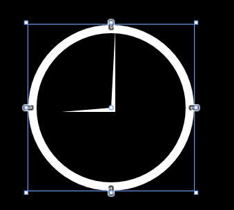
如何適應不同的解析度
如何適應不同的解析度這也是值得我們去解決的問題,畢竟不論是從8英寸的平板還是25英寸的桌上型電腦,甚至還有4英寸至7英寸的手機,在應用欄按鈕太多而螢幕不夠大時,多餘的按鈕該怎麼辦呢?
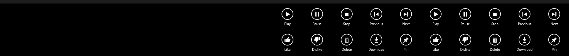
預設情況下,應用欄圖示的寬度都是確定好的100畫素哦。那麼我們先來看兩張圖片好了,由於Windows 10是可以直接調整Modern應用的大小的(而不是windows 8那種只能全屏顯示),所以我直接拉伸Modern大小以模擬解析度的概率啦。
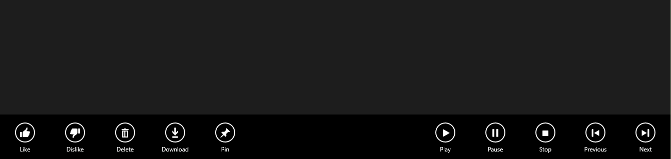
<Page.BottomAppBar>
<AppBar x:Name="bottomAppBar" IsSticky="True">
<Grid>
<StackPanel x:Name="leftBottomAppBar"
Orientation="Horizontal">
<AppBarButton Label="Like" Icon="Like"/>
<AppBarButton Label="Dislike" Icon="Dislike"/>
<AppBarButton Label="Delete" Icon="Delete"/>
<AppBarButton Label="Download" Icon="Download"/>
<AppBarButton Label="Pin" Icon="Pin"/>
</StackPanel>
<StackPanel x:Name="rightBottomAppBar"
Orientation="Horizontal" HorizontalAlignment="Right">
<AppBarButton Label="Play" Icon="Play"/>
<AppBarButton Label="Pause" Icon="Pause"/>
<AppBarButton Label="Stop" Icon="Stop"/>
<AppBarButton Label="Previous" Icon="Previous"/>
<AppBarButton Label="Next" Icon="Next"/>
</StackPanel>
</Grid>
</AppBar>
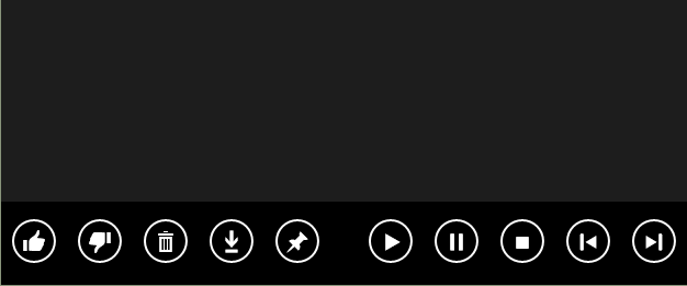
</Page.BottomAppBar>這裡為了除錯更加方便,所以使用了IsSticky屬性。AppBarButton還有一個很重要的屬性喲,之前用不到,不過這裡就是核心成員了呢,它就是IsCompact。這個屬性可以讓應用欄按鈕只顯示圖示而不顯示文字,也就是Label啦。那麼我們的工作就要圍繞這個屬性來展開了。
我們可以這樣假設,有一個函式,它有一個布林變數的引數,引數為真的話呢,那麼所有的這些AppBarButton的IsCompact屬性也為真。在以下這段程式碼中,我們先將bottomAppBar的自物件選取為root,這樣一來的話呢,如果應用中還有頂部的應用欄,就不會相互干擾啦。然後逐步取出root和panel中的自物件就好咯。
private void AppBarButtonCompact(bool isCompact)
{
Panel root = bottomAppBar.Content as Panel;
if(root!=null)
{
foreach(Panel panel in root.Children)
{
foreach (ICommandBarElement child in panel.Children)
{
child.IsCompact = isCompact;
}
}
}
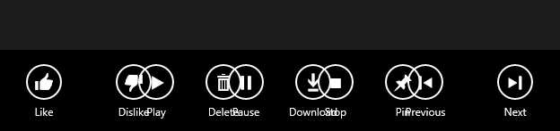
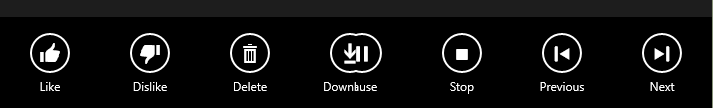
}接下來還需要判斷到底需不需要啟用IsCompact,那這又是由什麼決定的呢,既然前面提到是因為螢幕的解析度,也就是所應用所佔用的寬度會導致應用欄發生重疊,那麼答案就毫無疑問了。看到下面的程式碼相信大家都明白了,至於為何是寬度的界限在1000呢,那是因為有10個AppBarButton,前面也說了它們的寬度是100。(不帶Label的話呢,就只需要60畫素啦。)
     void AppSizeChanged(object sender, SizeChangedEventArgs e)
        {
            if (e.NewSize.Width != e.PreviousSize.Width)
            {
                if (e.NewSize.Width < 1000)
                {
                    AppBarButtonCompact(true);
                }
                else
                {
                    AppBarButtonCompact(false);
                }
            }
        }
來張圖片以示搞定這個問題了吧。
但是像我這麼鑽牛角尖的人,10個AppBarButton用這種方式搞定了,那20個呢?我們就來演示一下,把之前XAML中的AppBarButton複製貼上一番。如果是2K、4K的螢幕應對20個沒問題啊,但我這1920X1080的螢幕就放不下了。

那麼這又有什麼辦法可以解決的嗎?當然有啦,將這20個圖示切成2列就好啦。我們首先在Grid中新增一行。
<Grid.RowDefinitions>
    <RowDefinition Height="auto"/>
    <RowDefinition Height="auto"/>
</Grid.RowDefinitions>
再通過下面這張方式來調整它處於哪一行,以及在水平方向的右側還是左側。這裡我將兩行都設定在右側啦。
leftBottomAppBar.SetValue(Grid.RowProperty, 1);
leftBottomAppBar.SetValue(HorizontalAlignmentProperty, HorizontalAlignment.Right);
當然了,這樣一來就可以放40個AppBarButton啦,如果縮小應用的大小的話為了容納更多還可以用IsCompact屬性呢。不過沒有哪個應用做成這樣吧^_^
另外呢,如果把應用欄設計成這樣的話。
<Page.BottomAppBar>
   <AppBar x:Name="bottomAppBar" IsSticky="True">
      <Grid>
         <Grid.ColumnDefinitions>
             <ColumnDefinition Width="*"/>
             <ColumnDefinition Width="*"/>
         </Grid.ColumnDefinitions>
         <StackPanel Grid.Column="0" x:Name="leftBottomAppBar"  Orientation="Horizontal" HorizontalAlignment="Left">
             <AppBarButton Label="Like" Icon="Like"/>
             <AppBarButton Label="Dislike" Icon="Dislike"/>
             <AppBarButton Label="Delete" Icon="Delete"/>
             <AppBarButton Label="Download" Icon="Download"/>
             <AppBarButton Label="Pin" Icon="Pin"/>
         </StackPanel>
         <StackPanel Grid.Column="1" x:Name="rightBottomAppBar" Orientation="Horizontal" HorizontalAlignment="Right">
             <AppBarButton Label="Play" Icon="Play"/>
             <AppBarButton Label="Pause" Icon="Pause"/>
             <AppBarButton Label="Stop" Icon="Stop"/>
             <AppBarButton Label="Previous" Icon="Previous"/>
             <AppBarButton Label="Next" Icon="Next"/>
         </StackPanel>
      </Grid>
   </AppBar>
</Page.BottomAppBar>
那麼對於Windows 10,在拉伸的過程中,中間部分的控制元件就會慢慢消失啦。以下這張圖片呢,是我在拉伸到中間有2個控制元件剛好重疊的時候啦。至於把AppBarButton設計成這樣是好是壞大家自己決定咯,我反正覺得這樣不好呢。不過有意思的是,即便如此,它們彼此的Click事件還都是有效的噢,會區分左右兩部分,而不會疊在一起。
當然啦,這個的應用遠不是應用欄這麼簡單喲,對於其他的前景,比如有兩個TextBlock在螢幕左右兩側,當應用把收縮變小之後也可以讓這個TextBlock疊成2層在螢幕的一邊。
在應用欄上新增選單
我們都見過有選單的應用欄按鈕對吧,這個的實現其實也挺簡單的。用Flyout屬性就好啦。
<Page.BottomAppBar>
    <CommandBar>
        <AppBarButton Icon="Rotate" Label="Rotate">
            <AppBarButton.Flyout>
                <MenuFlyout>
                   <MenuFlyoutItem Text="Rotate 90" Click="MenuFlyoutItem_Click" Tag="Rotate90"/>
                   <MenuFlyoutItem Text="Rotate 180" Click="MenuFlyoutItem_Click" Tag="Rotate180"/>
                   <MenuFlyoutItem Text="Rotate 270" Click="MenuFlyoutItem_Click" Tag="Rotate270"/>
               </MenuFlyout>
           </AppBarButton.Flyout>
       </AppBarButton>
   </CommandBar>
</Page.BottomAppBar>
Tag屬性嘛,既然童鞋們在看CSDN部落格,那自然就知道Tag啦。下面這段程式碼就讓Flyout選單發揮作用啦。
private void MenuFlyoutItem_Click(object sender, RoutedEventArgs e)
{
    MenuFlyoutItem selectedItem = sender as MenuFlyoutItem;

    if (selectedItem != null)
    {
        if (selectedItem.Tag.ToString() == "Rotate90")
        {
            DoRotate(90);
        }
        else if (selectedItem.Tag.ToString() == "Rotate180")
        {
            DoRotate(180);
        }
        else if (selectedItem.Tag.ToString() == "Rotate270")
        {
            DoRotate(270);
        }
    }
}
感謝訪問,希望對您有所幫助。 歡迎關注或收藏、評論或點贊。
為使本文得到斧正和提問,轉載請註明出處:
http://blog.csdn.net/nomasp
相關文章
- 【萬里征程——Windows App開發】應用設定和應用幫助WindowsAPP
- 【萬里征程——Windows App開發】在應用中整合搜尋WindowsAPP
- 【萬里征程——Windows App開發】動畫1WindowsAPP動畫
- 【萬里征程——Windows App開發】開發準備WindowsAPP
- 【萬里征程——Windows App開發】使用Toast通知WindowsAPPAST
- 【萬里征程——Windows App開發】繪製圖形WindowsAPP
- 【萬里征程——Windows App開發】畫筆和影象WindowsAPP
- 【萬里征程——Windows App開發】補充:JSONWindowsAPPJSON
- 【萬里征程——Windows App開發】動態磁貼WindowsAPP
- 【萬里征程——Windows App開發】如何儲存、讀取、刪除應用資料WindowsAPP
- 【萬里征程——Windows App開發】使用華麗麗的字型WindowsAPP
- 【萬里征程——Windows App開發】如何使用貼上板WindowsAPP
- 【萬里征程——Windows App開發】用浮出控制元件做預覽效果WindowsAPP控制元件
- 【萬里征程——Windows App開發】DatePicker&TimepickerWindowsAPP
- 【萬里征程——Windows App開發】ListView&GridView之分組WindowsAPPView
- 【萬里征程——Windows App開發】SemanticZoom檢視切換WindowsAPPOOM
- 【萬里征程——Windows App開發】控制元件大集合1WindowsAPP控制元件
- 【萬里征程——Windows App開發】控制元件大集合2WindowsAPP控制元件
- 【萬里征程——Windows App開發】DatePickerFlyout、TimePickerFlyout的使用WindowsAPP
- 【萬里征程——Windows App開發】頁面佈局和基本導航WindowsAPP
- 【萬里征程——Windows App開發】編輯文字及鍵盤輸入WindowsAPP
- 【萬里征程——Windows App開發】ListView&GridView之新增資料WindowsAPPView
- 【萬里征程——Windows App開發】檔案&資料——檔案選取器WindowsAPP
- 【萬里征程——Windows App開發】檔案&資料——寫入與讀取WindowsAPP
- 【萬里征程——Windows App開發】設定共享(共享源和共享目標)WindowsAPP
- 【萬里征程——Windows App開發】檔案&資料——獲取檔案屬性WindowsAPP
- 【萬里征程——Windows App開發】檔案&資料——讀取檔案/資料夾名WindowsAPP
- 【萬里征程——Windows App開發】資料繫結——簡單示例、更改通知、資料轉換WindowsAPP
- 【萬里征程——Windows App開發】如何在多個頁面間讀取/儲存檔案【草稿】WindowsAPP
- Windows App 應用開發教程WindowsAPP
- 用uni-app開發app應用登陸APP
- Windows 應用開發的系統要求Windows
- 最佳實踐(3):Windows應用開發Windows
- 安裝用於 Windows 應用開發的工具Windows
- 手機APP應用軟體開發APP
- 【轉載】App Inventor 開發BLE應用APP
- Windows Azure多租戶應用開發指南Windows
- Windows phone應用開發[15]-輔助工具Windows