一、scikit-learn 中的SVM
1、匯入模組
# 匯入模組
import numpy as np
import matplotlib.pyplot as plt
2、匯入鳶尾花資料集
#匯入鳶尾花資料集,並只取其中的兩個類別及兩個特徵值
from sklearn import datasets
iris = datasets.load_iris()
X = iris.data
y = iris.target
X = X[y<2,:2]
y = y[y<2]
print(X,y)
print(X.shape,y.shape)
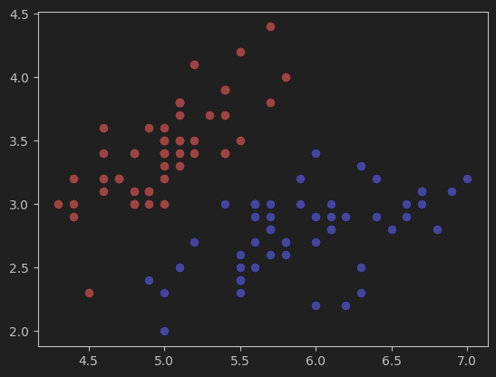
3、視覺化資料集
#視覺化資料集
plt.scatter(X[y==0,0],X[y==0,1],color='red')    # y==0,標籤為0的資料
plt.scatter(X[y==1,0],X[y==1,1],color='blue')
plt.show()
4、標準化資料集
# 標準化資料集
from  sklearn.preprocessing import StandardScaler
standardScaler = StandardScaler()
standardScaler.fit(X)
X_standard = standardScaler.transform(X)    # X_standard為標準化後的資料
5、定義繪製決策邊界的函式
# 曲線勾畫模型的決策邊界函式
def plot_decision_boundary(model, axis):
    # 建立網格
    x0, x1 = np.meshgrid(
        np.linspace(axis[0], axis[1], int((axis[1] - axis[0]) * 100)).reshape(-1, 1),
        np.linspace(axis[2], axis[3], int((axis[3] - axis[2]) * 100)).reshape(-1, 1),
    )
    x_new = np.c_[x0.ravel(), x1.ravel()]
	# 預測
    y_predict = model.predict(x_new)
    zz = y_predict.reshape(x0.shape)
    # 引入自定義顏色對映
    from matplotlib.colors import ListedColormap
    custom_cmap = ListedColormap(['#EF9A9A','#FFF59D','#90CAF9'])
    # 繪製決策邊界
    plt.contourf(x0, x1, zz, cmap=custom_cmap)

6、實現硬間隔的SVM模型
# 匯入硬間隔SVM,並訓練模型
from sklearn.svm import LinearSVC
svc = LinearSVC(C=1e9)  # C=1e9表示正無窮大,C為錯誤樣本的懲罰引數
svc.fit(X_standard,y)
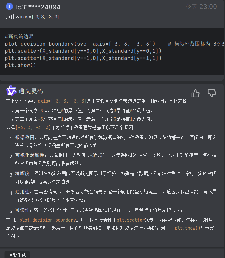
7、繪製硬間隔SVM決策邊界
#畫決策邊界
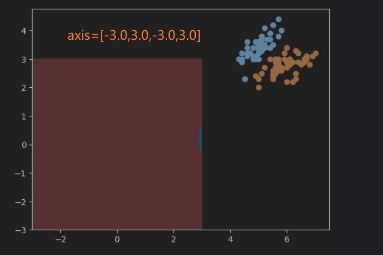
plot_decision_boundary(svc, axis=[-3, 3, -3, 3]) # 橫縱坐範圍都為-3到3
plt.scatter(X_standard[y==0,0],X_standard[y==0,1])
plt.scatter(X_standard[y==1,0],X_standard[y==1,1])
plt.show()
網格的大小應該如何設定?
8、實現軟間隔的SVM模型
#實現軟間隔的SVM模型
svc2 = LinearSVC(C=0.01)
svc2.fit(X_standard,y)
9、繪製軟間隔的SVM決策邊界
#視覺化模型svc2的決策邊界
plot_decision_boundary(svc2, axis=[-3, 3, -3, 3])   # model引數為svc2
plt.scatter(X_standard[y==0,0],X_standard[y==0,1])
plt.scatter(X_standard[y==1,0],X_standard[y==1,1])
plt.show()
10、獲取係數和截距
#獲取係數和截距
print(svc2.coef_)
print(svc2.intercept_)
[[ 0.43789749 -0.410919  ]]
[0.00592601]
11、定義繪製決策邊界、超平面的函式
#勾畫決策邊界以及支援向量機超平面函式
def plot_svc_decision_boundary(model, axis):
    # 決策邊界(與上面的類似)
    x0, x1 = np.meshgrid(
        np.linspace(axis[0], axis[1], int((axis[1] - axis[0]) * 100)).reshape(-1, 1),
        np.linspace(axis[2], axis[3], int((axis[3] - axis[2]) * 100)).reshape(-1, 1),
    )
    x_new = np.c_[x0.ravel(), x1.ravel()]

    y_predict = model.predict(x_new)
    zz = y_predict.reshape(x0.shape)

    from matplotlib.colors import ListedColormap
    custom_cmap = ListedColormap(['#EF9A9A','#FFF59D','#90CAF9'])

    plt.contourf(x0, x1, zz, cmap=custom_cmap)

    # 超平面
    w = model.coef_[0]
    b = model.intercept_[0]

    # 超平面的方程是 w0*x0 + w1*x1 + b = 0,其中 w0 和 w1 是權重,x0 和 x1 是特徵變數,b 是截距。
    # 以特徵變數x1作為另一個特徵變數x0的函式(可以理解為x0是自變數,x1是應變數),來繪製平面==> x1 = -w0/w1 * x0 - b/w1
    plot_x = np.linspace(axis[0], axis[1], 200)

    # 計算超平面邊界線、上下邊界線,在x1軸上的值。(這裡的x1軸類似於x-y座標中的y軸,x0軸類似於x軸)
    y = -w[0]/w[1] * plot_x - b/w[1]
    up_y = -w[0]/w[1] * plot_x - (b+1)/w[1]
    down_y = -w[0]/w[1] * plot_x - (b-1)/w[1]

    # 篩選出位於axis[2]和axis[3]範圍內的y_index、up_index、down_index
    # 也就是處於網格範圍內的資料,網格之外的就不顯示了
    y_index = (y >= axis[2]) & (y <= axis[3])
    up_index = (up_y >= axis[2]) & (up_y <= axis[3])
    down_index = (down_y >= axis[2]) & (down_y <= axis[3])

    # 畫出超平面、上下邊界線
    plt.plot(plot_x[y_index],y[y_index], color='black')
    plt.plot(plot_x[up_index], up_y[up_index], color='black')
    plt.plot(plot_x[down_index], down_y[down_index], color='black')
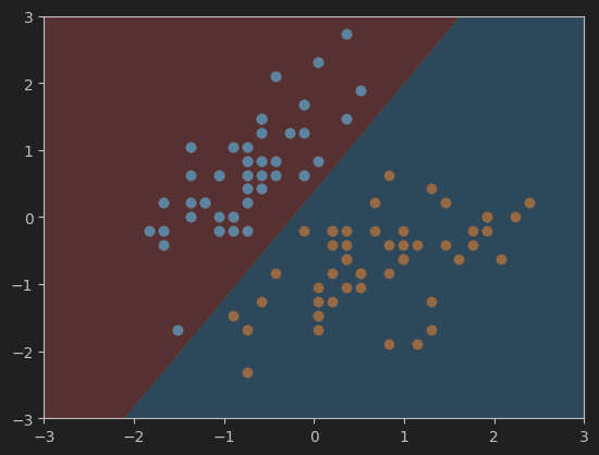
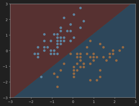
12、畫軟間隔SVM的超平面及決策邊界
#畫svc模型的超平面及決策邊界
plot_svc_decision_boundary(svc, axis=[-3, 3, -3, 3])
plt.scatter(X_standard[y==0,0],X_standard[y==0,1])
plt.scatter(X_standard[y==1,0],X_standard[y==1,1])
plt.show()
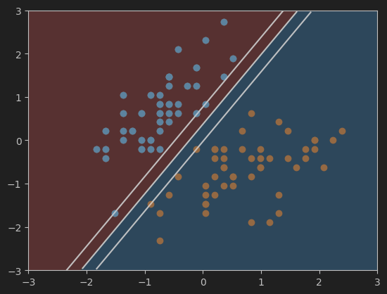
13、畫硬間隔SVM的超平面及決策邊界
#畫svc2模型的超平面及決策邊界
plot_svc_decision_boundary(svc2, axis=[-3, 3, -3, 3])
plt.scatter(X_standard[y==0,0],X_standard[y==0,1])
plt.scatter(X_standard[y==1,0],X_standard[y==1,1])
plt.show()
二、SVM中使用多項式特徵
1、匯入make_moons資料集
#匯入make_moons資料集
import numpy as np
import matplotlib.pyplot as plt
from sklearn import datasets

X, y = datasets.make_moons()    # 特徵矩陣X和標籤向量y
print(X.shape,y.shape)
print(X,y)
資料集形狀和鳶尾花的差不多
2、視覺化資料集
#視覺化匯入的資料集
plt.scatter(X[y==0,0],X[y==0,1])
plt.scatter(X[y==1,0],X[y==1,1])
plt.show()
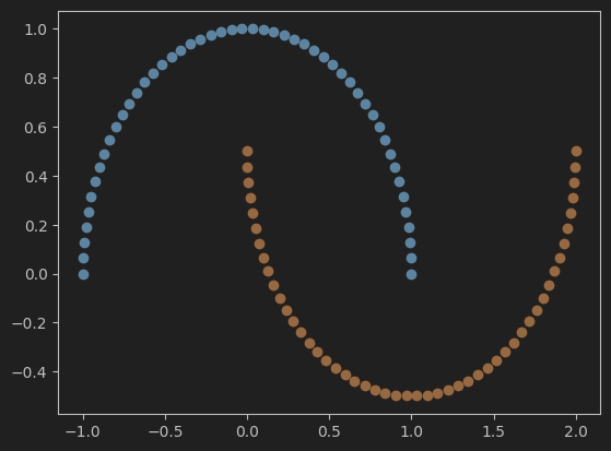
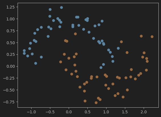
3、重新匯入打亂後的make_moons資料集並視覺化
# 重新匯入打亂後的make_moons資料集並視覺化
X, y = datasets.make_moons(noise=0.15, random_state=666)

plt.scatter(X[y==0,0],X[y==0,1])
plt.scatter(X[y==1,0],X[y==1,1])
plt.show()

4、使用Pipeline封裝,並新增多項式特徵
#使用Pipeline封裝,並用PolynomialFeatures新增多項式特徵
from sklearn.preprocessing import PolynomialFeatures,StandardScaler
from sklearn.svm import LinearSVC
from sklearn.pipeline import Pipeline

def PolynomialSVC(degree, C=1.0):
    # 使用Pipeline封裝(簡化了從原始特徵到最終分類預測的整個流程)
    return Pipeline([
        ('poly', PolynomialFeatures(degree=degree)),    # 新增多項式特徵
        ('std_scaler', StandardScaler()),   # 標準化資料
        ('linearSVC', LinearSVC(C=C))   # 使用線性支援向量機linearSVC進行分類
    ])
5、訓練模型
#喂資料並訓練模型
poly_svc = PolynomialSVC(degree=3)
poly_svc.fit(X,y)
6、定義繪製決策邊界的函式
# 畫模型的決策邊界
def plot_decision_boundary(model, axis):
    # 建立網格
    x0, x1 = np.meshgrid(
        np.linspace(axis[0], axis[1], int((axis[1] - axis[0]) * 100)).reshape(-1, 1),
        np.linspace(axis[2], axis[3], int((axis[3] - axis[2]) * 100)).reshape(-1, 1),
    )
    x_new = np.c_[x0.ravel(), x1.ravel()]   # 合併網格

    y_predict = model.predict(x_new)
    zz = y_predict.reshape(x0.shape)    # 重塑為與網格相同形狀的陣列

    from matplotlib.colors import ListedColormap
    custom_cmap = ListedColormap(['#EF9A9A','#FFF59D','#90CAF9'])

    plt.contourf(x0, x1, zz, cmap=custom_cmap)  # 以填充的方式顯示決策邊界
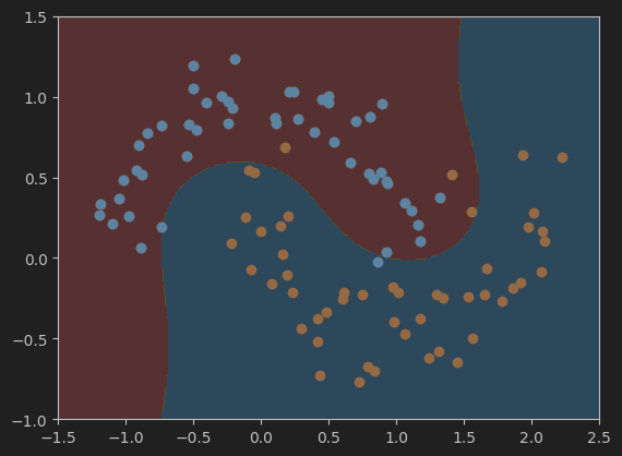
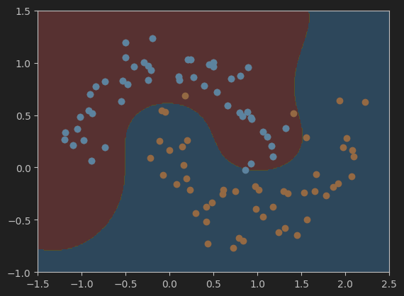
7、繪製決策邊界
# 呼叫函式繪製決策邊界
plot_decision_boundary(poly_svc, axis=[-1.5, 2.5, -1.0, 1.5])
# 畫出資料集散點圖
plt.scatter(X[y==0,0],X[y==0,1])
plt.scatter(X[y==1,0],X[y==1,1])
plt.show()
8、使用多項式核函式的SVM
(1)、封裝模型並訓練
# 使用多項式核函式poly(並喂資料訓練模型)
from sklearn.svm import SVC

# 定義封裝模型
def PolynomialKernelSVC(degree, C=1.0):
    return Pipeline([
        ('sed_scaler', StandardScaler()),   # 標準化資料
        ('kernelSVC', SVC(kernel='poly', degree=degree, C=C))   # 使用多項式核函式poly
    ])

# 訓練模型
poly_kernel_svc = PolynomialKernelSVC(degree=3)     # degree表示多項式的階數
poly_kernel_svc.fit(X,y)
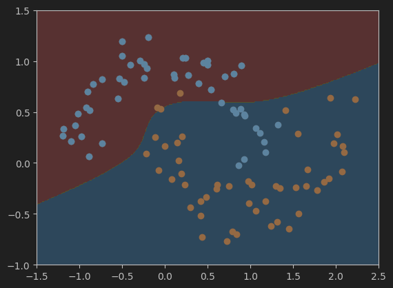
(2)、繪製模型決策邊界
#視覺化模型結果
# 繪製決策邊界的函式plot_decision_boundary,在掐面膜已經定義過了,所以這裡直接呼叫即可
plot_decision_boundary(poly_kernel_svc, axis=[-1.5, 2.5, -1.0, 1.5])
plt.scatter(X[y==0,0],X[y==0,1])
plt.scatter(X[y==1,0],X[y==1,1])
plt.show()
三、直觀理解高斯核函式
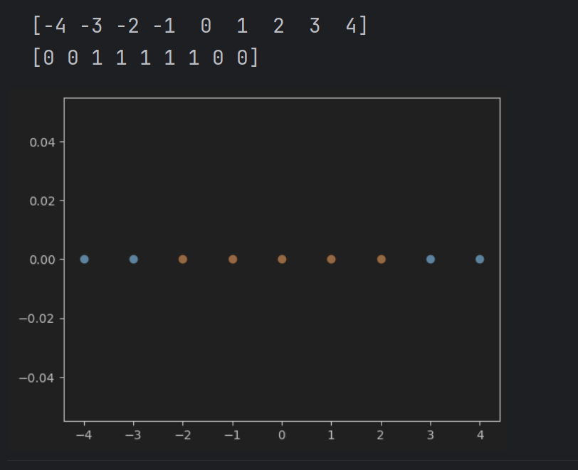
1、視覺化一維資料
#視覺化一維資料
import numpy as np
import matplotlib.pyplot as plt

x = np.arange(-4,5,1)   # 與rnage類似
print(x)

y = np.array((x>=-2) & (x<=2), dtype = 'int')   # 在標籤向量y中,標籤向量值為1的元素表示對應的x值在-2到2之間
print(y)

# 畫出資料集散點圖
plt.scatter(x[y==0],[0]*len(x[y==0]))
# [0]*len(x[y==0])表示對應的y值都為0
plt.scatter(x[y==1],[0]*len(x[y==1]))
plt.show()
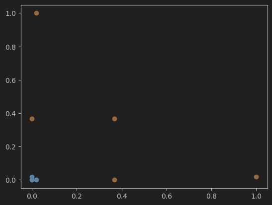
2、視覺化高斯函式升維後的結果
# 視覺化使用高斯函式進行升維後的結果
def gaussian(x,l):
    gamma = 1.0
    return np.exp(-gamma * ((x-l)**2))  # x與l之間距離的指數衰減值


l1, l2 = -1,1   # 高斯函式中心點

X_new = np.empty((len(x),2))
for i,data in enumerate(x):
    # 分別計算以l1和l2為中點,以l1和l2為中心的高斯值。
    X_new[i,0] = gaussian(data,l1)
    X_new[i,1] = gaussian(data,l2)

# 繪製高斯升維後的散點圖
plt.scatter(X_new[y==0,0],X_new[y==0,1])
plt.scatter(X_new[y==1,0],X_new[y==1,1])
plt.show()
四、scikit-learn 中的 RBF 核
1、載入並視覺化make_moons資料集
#載入並視覺化make_moons資料集
import numpy as np
import matplotlib.pyplot as plt

from sklearn import datasets

X, y = datasets.make_moons(noise=0.15, random_state=666)
plt.scatter(X[y==0,0],X[y==0,1])
plt.scatter(X[y==1,0],X[y==1,1])
plt.show()
2、使用RBF核函式的SVM訓練模型
#使用帶有高斯核函式(RBF)的SVM
from sklearn.preprocessing import StandardScaler
from sklearn.pipeline import Pipeline
from sklearn.svm import SVC

def RBFKernelSVC(gamma):
    return Pipeline([
        ('std_scaler', StandardScaler()),
        ('svc', SVC(kernel='rbf', gamma=gamma)) # 使用高斯核函式rbf
    ])

svc = RBFKernelSVC(gamma=1) # 建立模型
svc.fit(X,y)    # 訓練模型
3、定義繪製決策邊界的函式
#畫決策邊界的函式
def plot_decision_boundary(model, axis):

    x0, x1 = np.meshgrid(
        np.linspace(axis[0], axis[1], int((axis[1] - axis[0]) * 100)).reshape(-1, 1),
        np.linspace(axis[2], axis[3], int((axis[3] - axis[2]) * 100)).reshape(-1, 1),
    )
    x_new = np.c_[x0.ravel(), x1.ravel()]

    y_predict = model.predict(x_new)
    zz = y_predict.reshape(x0.shape)

    from matplotlib.colors import ListedColormap
    custom_cmap = ListedColormap(['#EF9A9A','#FFF59D','#90CAF9'])

    plt.contourf(x0, x1, zz, cmap=custom_cmap)
4、視覺化決策邊界
#視覺化模型svc的決策邊界
plot_decision_boundary(svc, axis=[-1.5, 2.5, -1.0, 1.5])
plt.scatter(X[y==0,0],X[y==0,1])
plt.scatter(X[y==1,0],X[y==1,1])
plt.show()
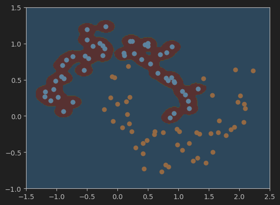
5、分別繪製gamma值為100、10、0.5、0.1是的決策邊界
#設定gamma值為100,並視覺化模型的決策邊界
svc_gamma100 = RBFKernelSVC(gamma=100)
svc_gamma100.fit(X,y)

plot_decision_boundary(svc_gamma100, axis=[-1.5, 2.5, -1.0, 1.5])
plt.scatter(X[y==0,0],X[y==0,1])
plt.scatter(X[y==1,0],X[y==1,1])
plt.show()
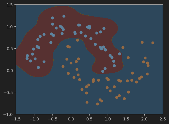
#設定gamma值為10,並視覺化模型的決策邊界
svc_gamma10 = RBFKernelSVC(gamma=10)
svc_gamma10.fit(X,y)

plot_decision_boundary(svc_gamma10, axis=[-1.5, 2.5, -1.0, 1.5])
plt.scatter(X[y==0,0],X[y==0,1])
plt.scatter(X[y==1,0],X[y==1,1])
plt.show()
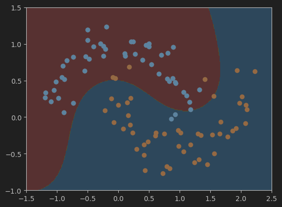
#設定gamma值為0.5,並視覺化模型的決策邊界
svc_gamma05 = RBFKernelSVC(gamma=0.5)
svc_gamma05.fit(X,y)

plot_decision_boundary(svc_gamma05, axis=[-1.5, 2.5, -1.0, 1.5])
plt.scatter(X[y==0,0],X[y==0,1])
plt.scatter(X[y==1,0],X[y==1,1])
plt.show()
#設定gamma值為0.1,並視覺化模型的決策邊界
svc_gamma01 = RBFKernelSVC(gamma=0.1)
svc_gamma01.fit(X,y)

plot_decision_boundary(svc_gamma01, axis=[-1.5, 2.5, -1.0, 1.5])
plt.scatter(X[y==0,0],X[y==0,1])
plt.scatter(X[y==1,0],X[y==1,1])
plt.show()
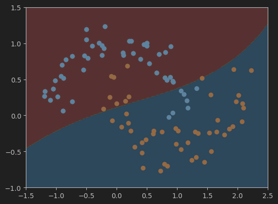
總結
總的來說,不同gamma值會對模型的結果有一定的影響,所以在訓練機器學習模型過程中超引數的選擇也是一個比較重要的學習內容。
五、作業:
使用帶有RBF核函式的SVM實現鳶尾花資料集的分類。
(1)匯入鳶尾花資料集並視覺化資料分佈。
(2)匯入模型。
(3)喂資料,訓練模型。
(4)視覺化模型決策邊界。
(5)利用Accuracy評估模型效果。
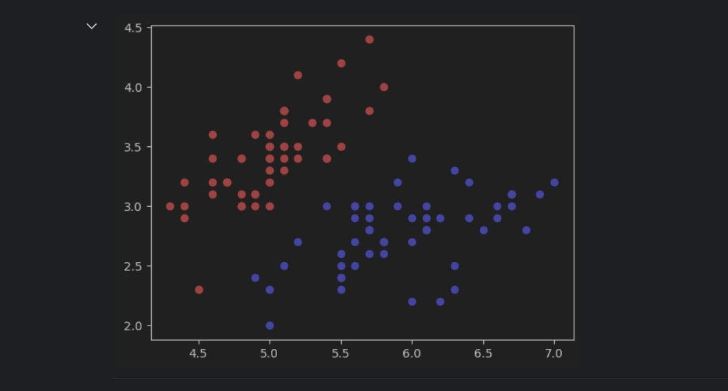
1、匯入鳶尾花資料集並視覺化資料分佈
#匯入鳶尾花資料集,並只取其中的兩個類別及兩個特徵值
from sklearn import datasets
iris = datasets.load_iris()
X = iris.data
y = iris.target
X = X[y<2,:2]
y = y[y<2]

#視覺化資料集
plt.scatter(X[y==0,0],X[y==0,1],color='red')    # y==0,標籤為0的資料
plt.scatter(X[y==1,0],X[y==1,1],color='blue')
plt.show()

2、建立並訓練模型
#使用帶有高斯核函式(RBF)的SVM
from sklearn.preprocessing import StandardScaler
from sklearn.pipeline import Pipeline
from sklearn.svm import SVC

def RBFKernelSVC(gamma):
    return Pipeline([
        ('std_scaler', StandardScaler()),   # 標準化
        ('svc', SVC(kernel='rbf', gamma=gamma)) # 使用高斯核函式rbf
    ])

svc = RBFKernelSVC(gamma=0.05) # 建立模型
# 一個個試,發現gamma=0.05效果最好(C預設為1)
# gamma=0.05效果就很好了,下面的網格搜搜尋就不用了。
svc.fit(X,y)    # 訓練模型
2.1、透過網格尋找合適的gamma值(可以不用)
# 透過網格尋找合適的gamma值
# 注意:這裡說的網格和上面繪製決策邊界時的網格不是一個意思。這裡的網格應該說的是一種尋找最佳gamma和C值的方法。
from sklearn.model_selection import GridSearchCV
pipe = Pipeline([
('scaler', StandardScaler()), # 首先對資料進行標準化
('svm', SVC(kernel='rbf')) # 使用RBF核的SVM
])
# 一次次調整引數網格,找到最佳引數
param_grid = {'svm__gamma': [0.01, 0.1, 1, 10], 'svm__C': [0.1, 1, 10, 100]} # 定義引數網格
grid_search = GridSearchCV(pipe, param_grid, cv=5) # 使用5折交叉驗證
grid_search.fit(X, y) # 訓練模型並找到最佳引數
best_gamma = grid_search.best_params_['svm__gamma'] # 獲取最佳gamma值
best_C = grid_search.best_params_['svm__C'] # 獲取最佳C值
print("Best gamma:", best_gamma)
print("Best C:", best_C)
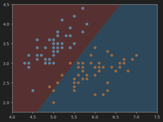
# 根據上面的網格搜尋,得到的最佳引數如下。(效果不太好,準確度只有0.96)繼續縮小範圍,在0.1附近找。
# Best gamma: 0.1
# Best C: 0.1
# 訓練模型
svc = SVC(kernel='rbf', gamma=best_gamma, C=best_C)
svc.fit(X, y)
這是gamma=0.1,Best C=0.1時的決策邊界,準確度只有0.96。
3、定義繪製決策邊界的函式
#畫決策邊界的函式
def plot_decision_boundary(model, axis):

    x0, x1 = np.meshgrid(
        np.linspace(axis[0], axis[1], int((axis[1] - axis[0]) * 100)).reshape(-1, 1),
        np.linspace(axis[2], axis[3], int((axis[3] - axis[2]) * 100)).reshape(-1, 1),
    )
    x_new = np.c_[x0.ravel(), x1.ravel()]

    y_predict = model.predict(x_new)
    zz = y_predict.reshape(x0.shape)

    from matplotlib.colors import ListedColormap
    custom_cmap = ListedColormap(['#EF9A9A','#FFF59D','#90CAF9'])

    plt.contourf(x0, x1, zz, cmap=custom_cmap)
4、視覺化決策邊界
#視覺化決策邊界
plot_decision_boundary(svc, axis=[4.0, 7.5, 1.75, 4.5])	# 網格引數的選擇(見下)
plt.scatter(X[y==0,0],X[y==0,1])
plt.scatter(X[y==1,0],X[y==1,1])
plt.show()
這是gamma=0.05,C=1時的決策邊界,準確度為1.
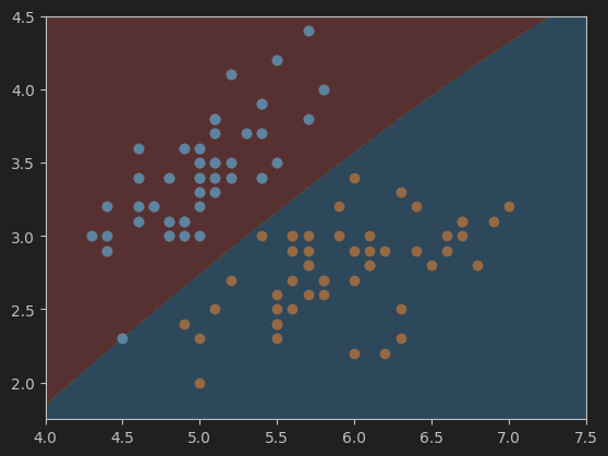
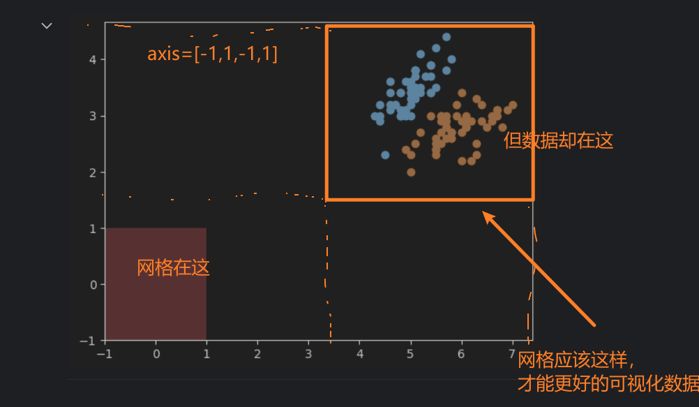
按照我的理解,網格的引數選取應該與資料在圖中表示的範圍有關。比如,鳶尾花原始的資料集在圖中顯示如下:
x軸的範圍大概在47.5之間,y軸的範圍在1.54.5之間。根據這個範圍來確定網格的引數,以保證網格能夠正確的顯示出資料。如果範圍小了,可能會有一些資料顯示不出來,大了的話,會導致資料在影像中太小,或者位置偏移中心,視覺化效果不好。
5、使用Accuracy評估模型效果
# 使用Accuracy評估模型效果
from sklearn.metrics import accuracy_score
y_predict = svc.predict(X)
accuracy = accuracy_score(y, y_predict)
print('準確度:',accuracy)
寫程式碼時問AI的一些記錄,留作備份
鳶尾花資料集形狀
numpy陣列
SVM多項式
直觀理解高斯核函式
gamma